Virtu
A modern, confident brand for a new kind of financial planning.
- Creative direction
- Brand strategy
- Brand identity
- Website design
Clarity
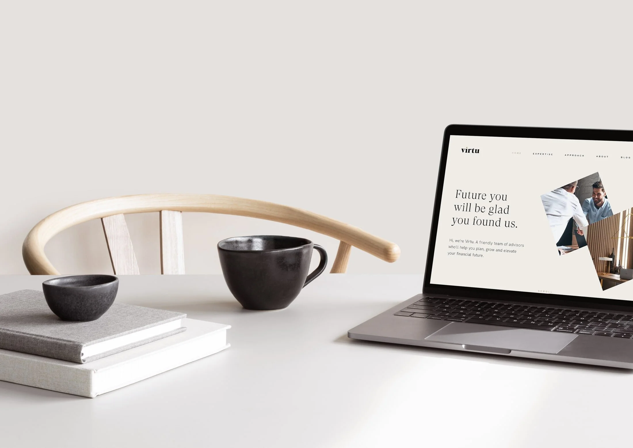
An experienced team of knowledgeable financial advisors, Virtu work with their clients to plan, grow and elevate their financial positions. Whether a first-time buyer or a seasoned investor, Virtu’s clients appreciate their relatable, no nonsense, and approachable service. Education and content marketing is a key part of showcasing the company’s knowledge and expertise, and every part of the client journey is considered to create the right impression and impact.
Brand essence
Assured · Approachable · Modern
Creative direction
Assured, approachable and distinctly modern, the Virtu brand aesthetic is sophisticated yet welcoming. It’s forward thinking without alienating those nearing retirement and high end, without putting off those starting their financial journeys.
This is an identity that reinforces Virtu’s position as market leaders, whilst still remaining approachable. An identity that perfectly reflects their distinctly modern approach to financial planning.
“You’ve hit the nail on the head with every aspect. We both agreed that your creative direction with this is outstanding. You’ve taken all of our thoughts and ideas of what we wanted to portray (without actually being able to clearly envisage it) and brought it to life perfectly. We really appreciate the time, thought and effort you’ve put into our brand, Jack. Thank you! And great work!”
Andrew tinker & Chris Holt · Founders
Colour palette
In Practice
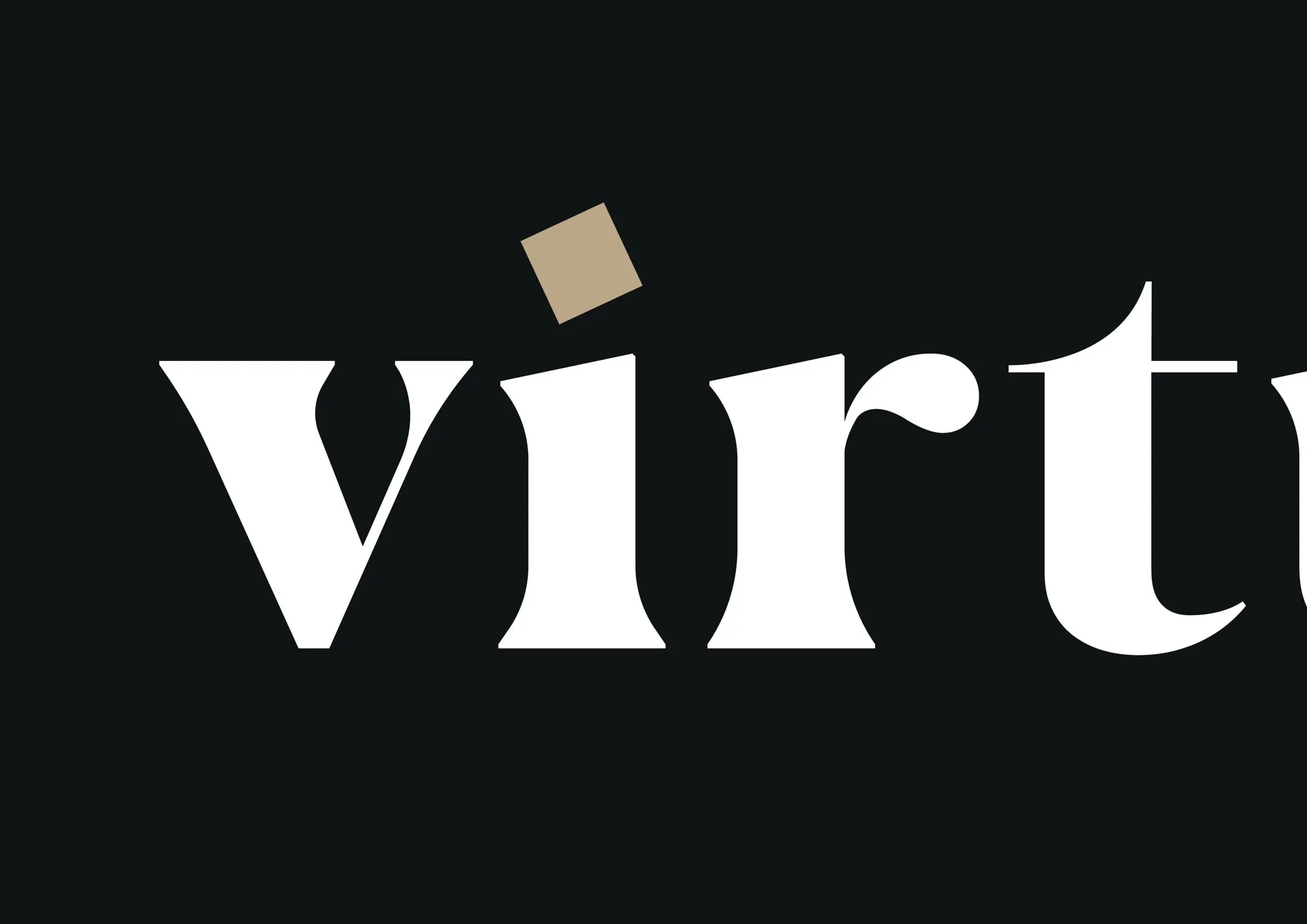
Typefaces and logotypes are elegant, simple and unfussy. Shapes and lines are straight forward, geometric, and clean.
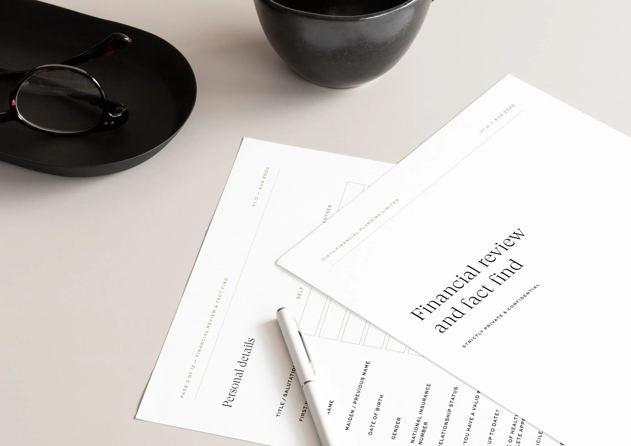
A key part of the Virtu experience and creating an assured, confident and distinctly modern experience for clients from beginning to end, the business documents and forms are carefully crafted to ensure ease of use, legibility and a clear sense of style.
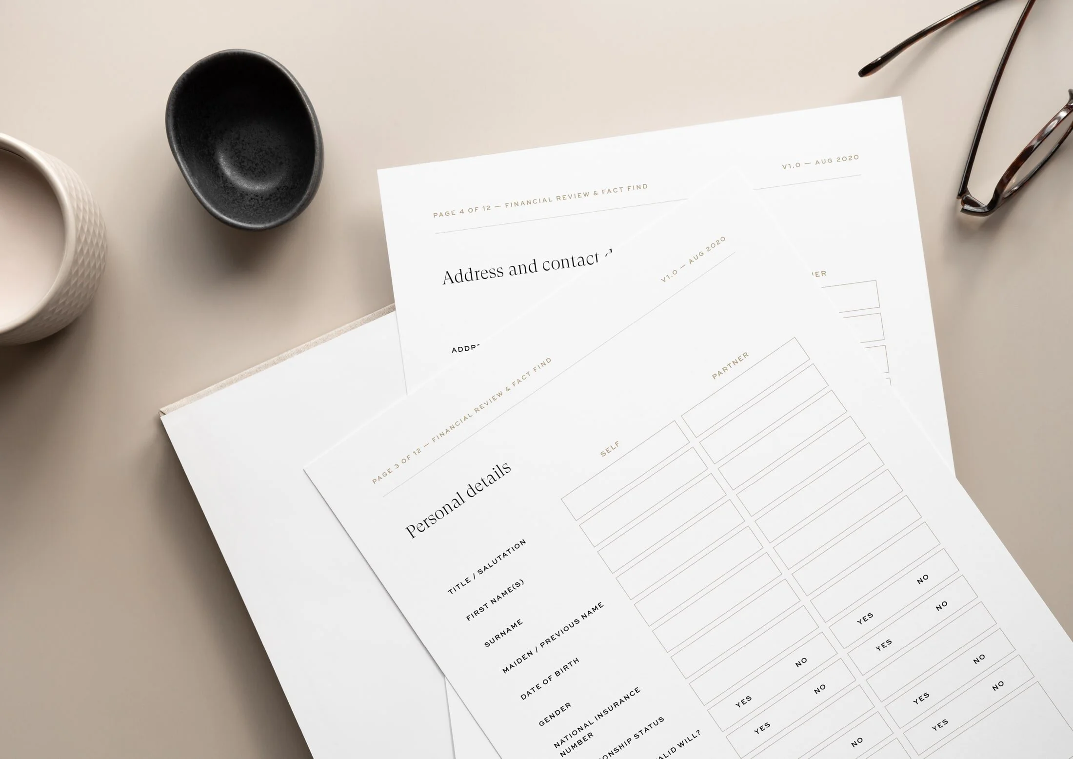
Paper textures are uncoated, natural and give a sense of grounding.
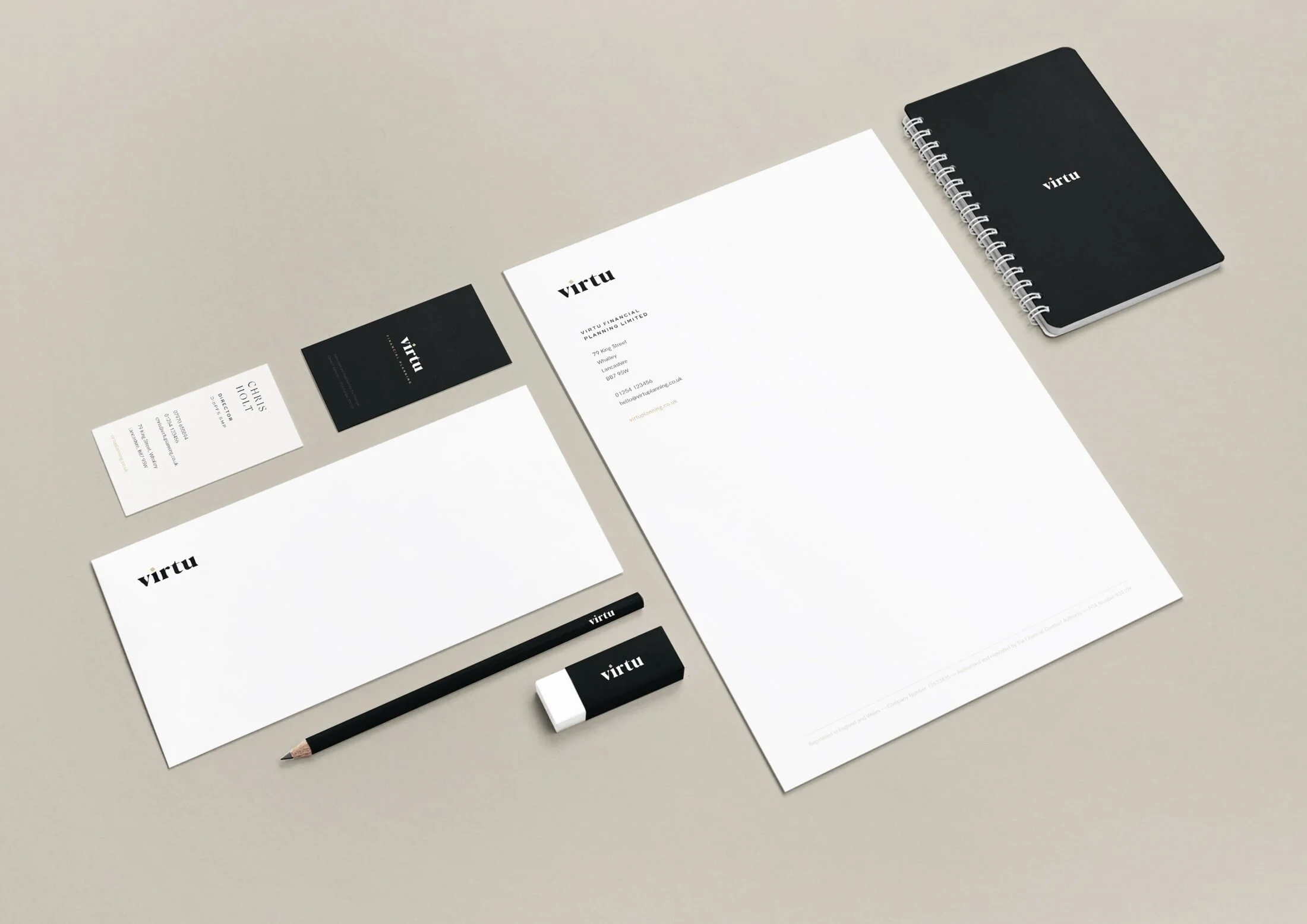
Business stationery is assured, confident, clear and simple. Subtle, thoughtful details elevate the experience, and make it one to remember.
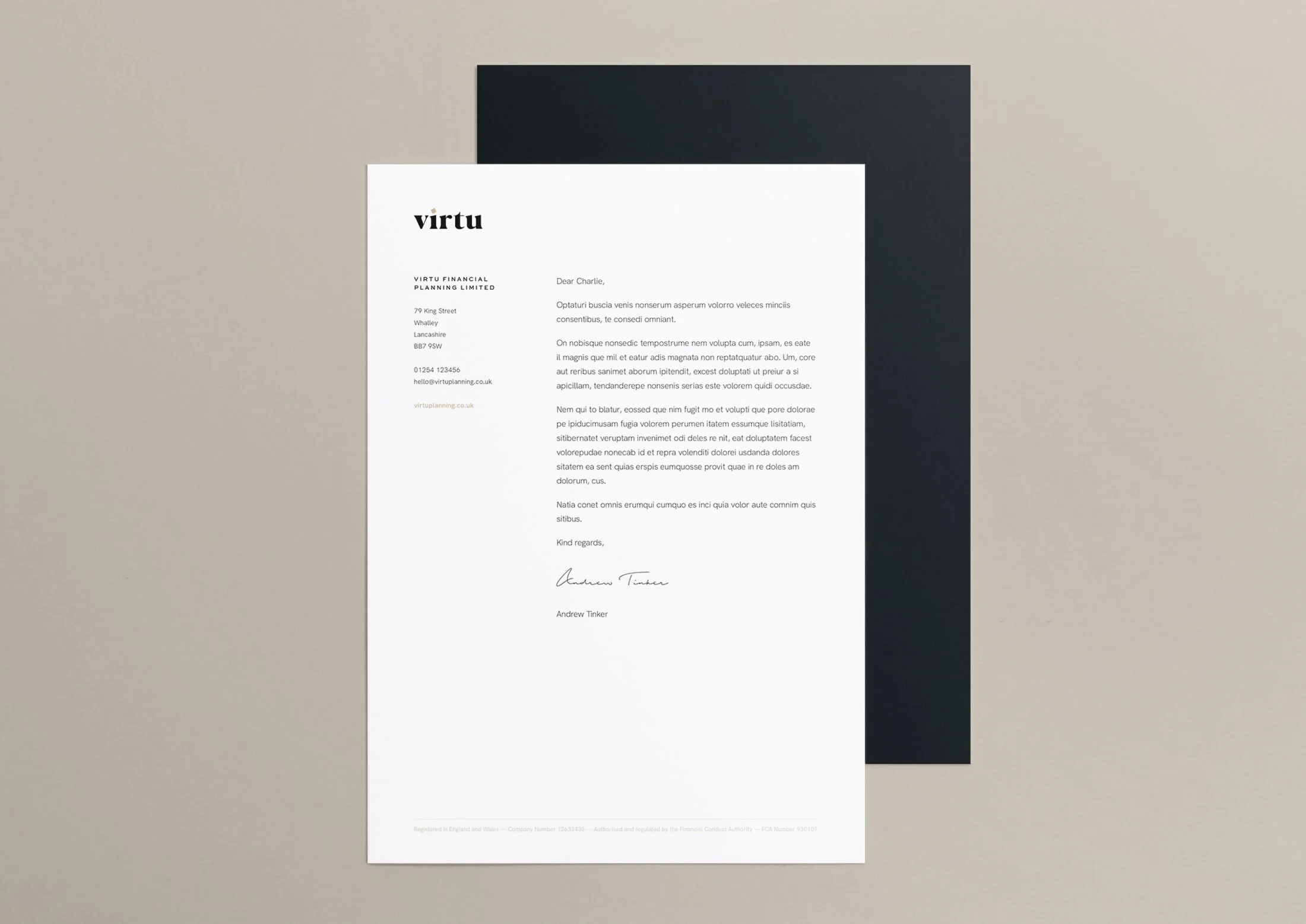
Letterheads are printed on uncoated, 120gsm paper stock for an earthy, natural, and approachable look and feel.
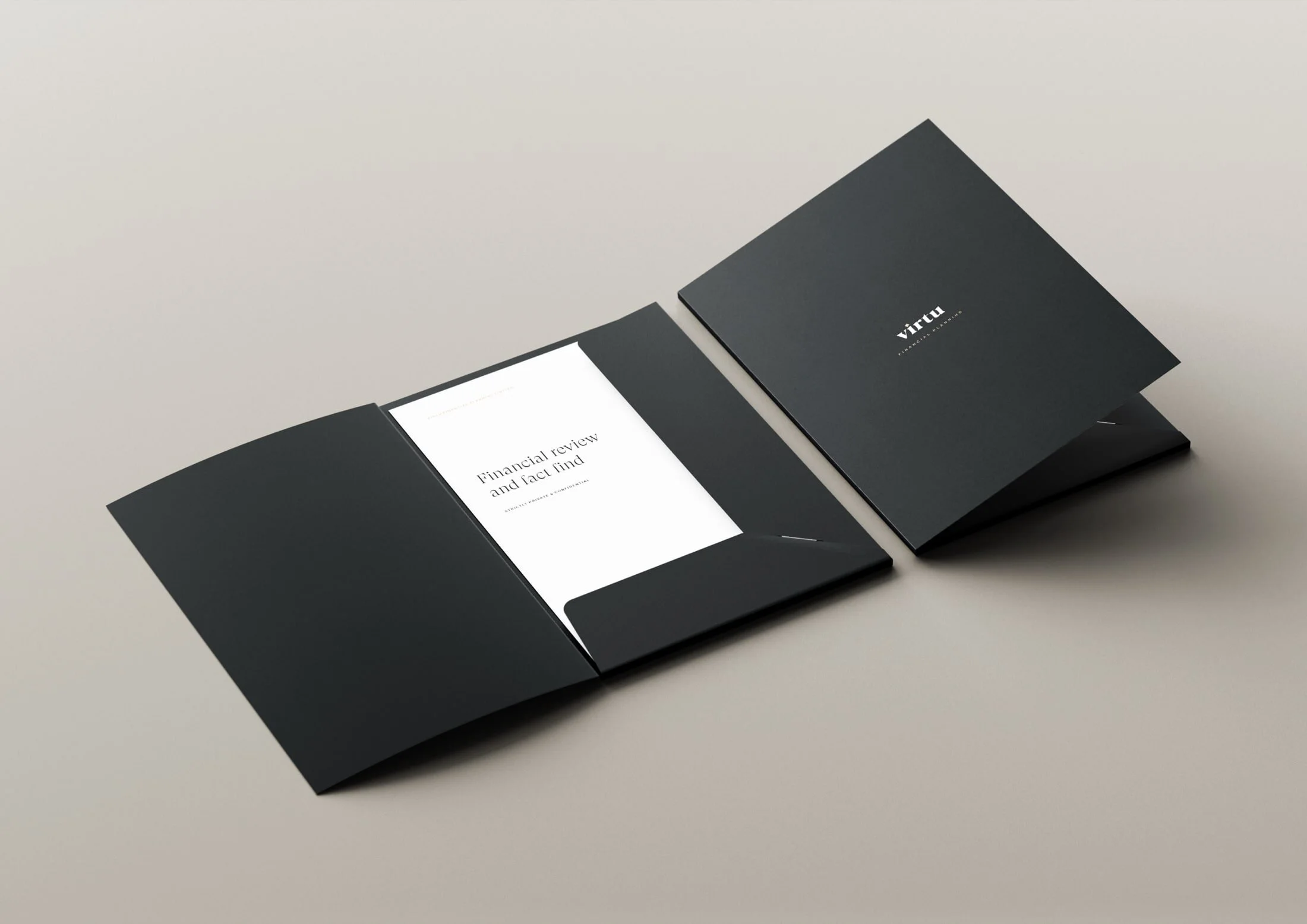
Another key part of making the process a memorable, organised and thought out experience, the company folders are used to ensure documents are kept together for both advisors and clients.
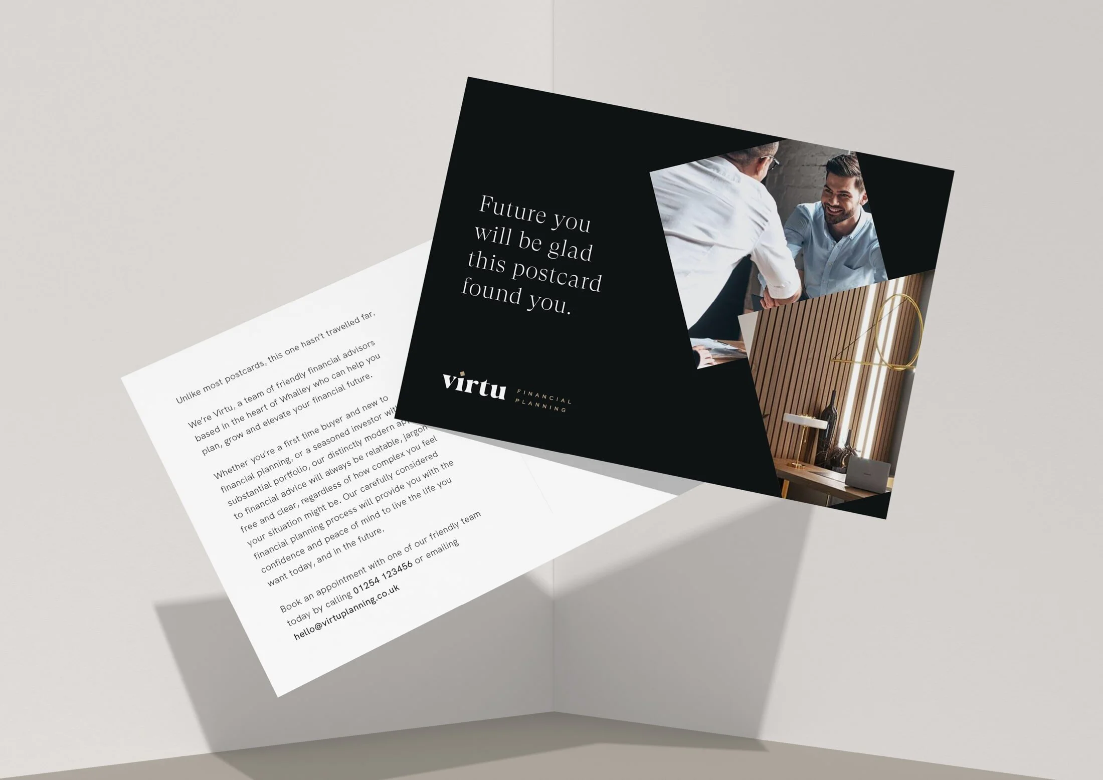
Creating intrigue around who Virtu are, these postcards aimed at prospective clients give an insight into the friendly, relatable, and approachable process that they offer.
With a thicker outer cover, the brochure is printed on 160gsm paper to ensure a luxurious look and feel.
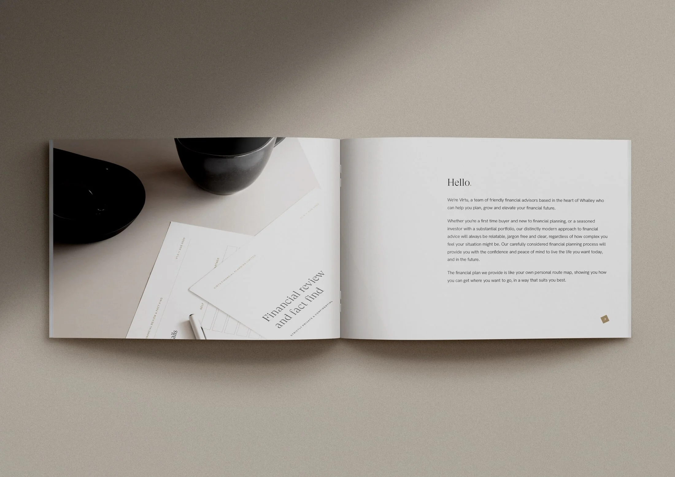
Showing their welcoming, natural and friendly approach to financial advice, but without undermining their expertise, the company brochure is a carefully considered balance of typography and high quality imagery that gives an insight into the design-driven experience of working with the Virtu team.
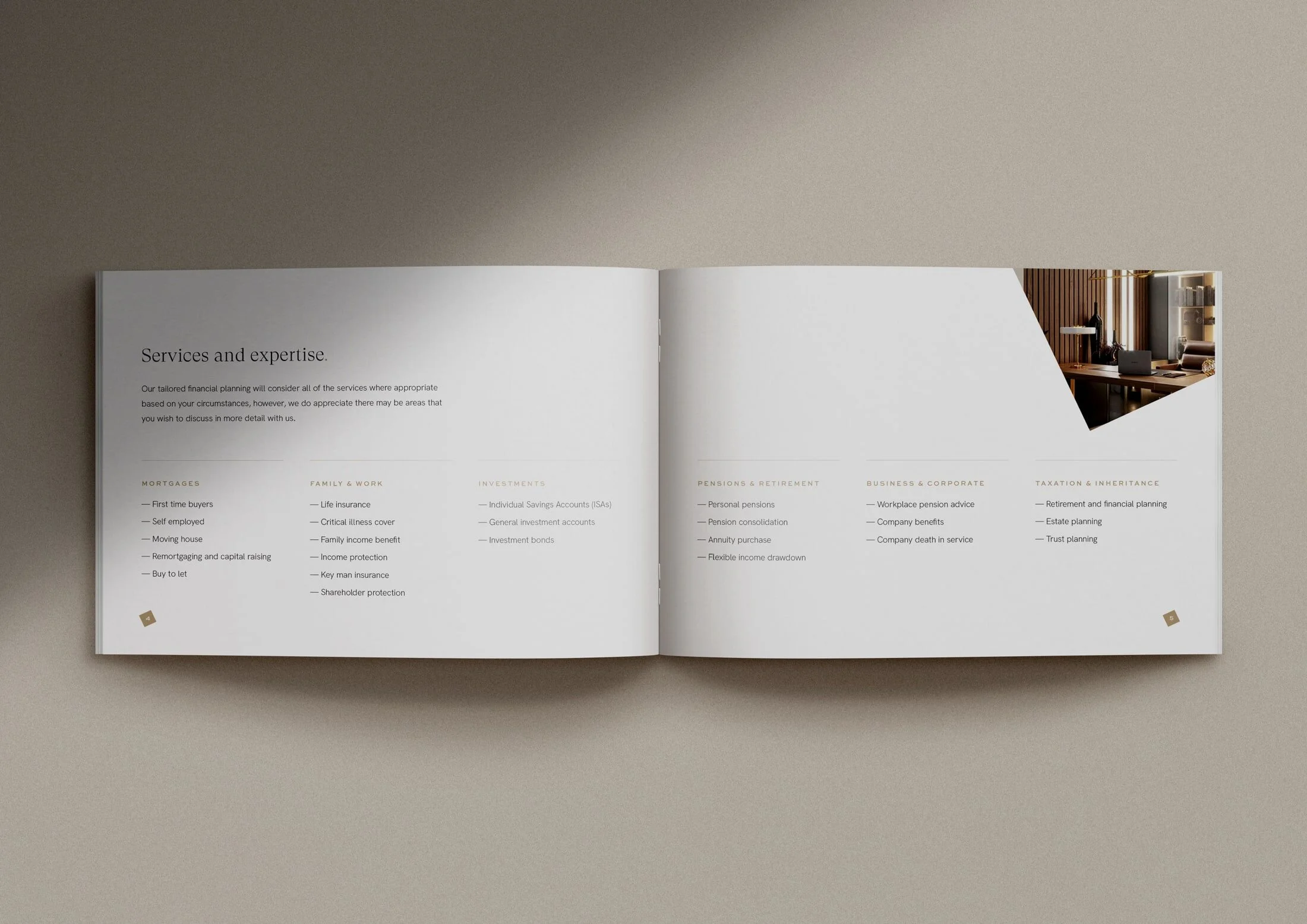
The brand’s tone of voice is genuine, aspirational, transparent and human – it’s a jargon free zone.
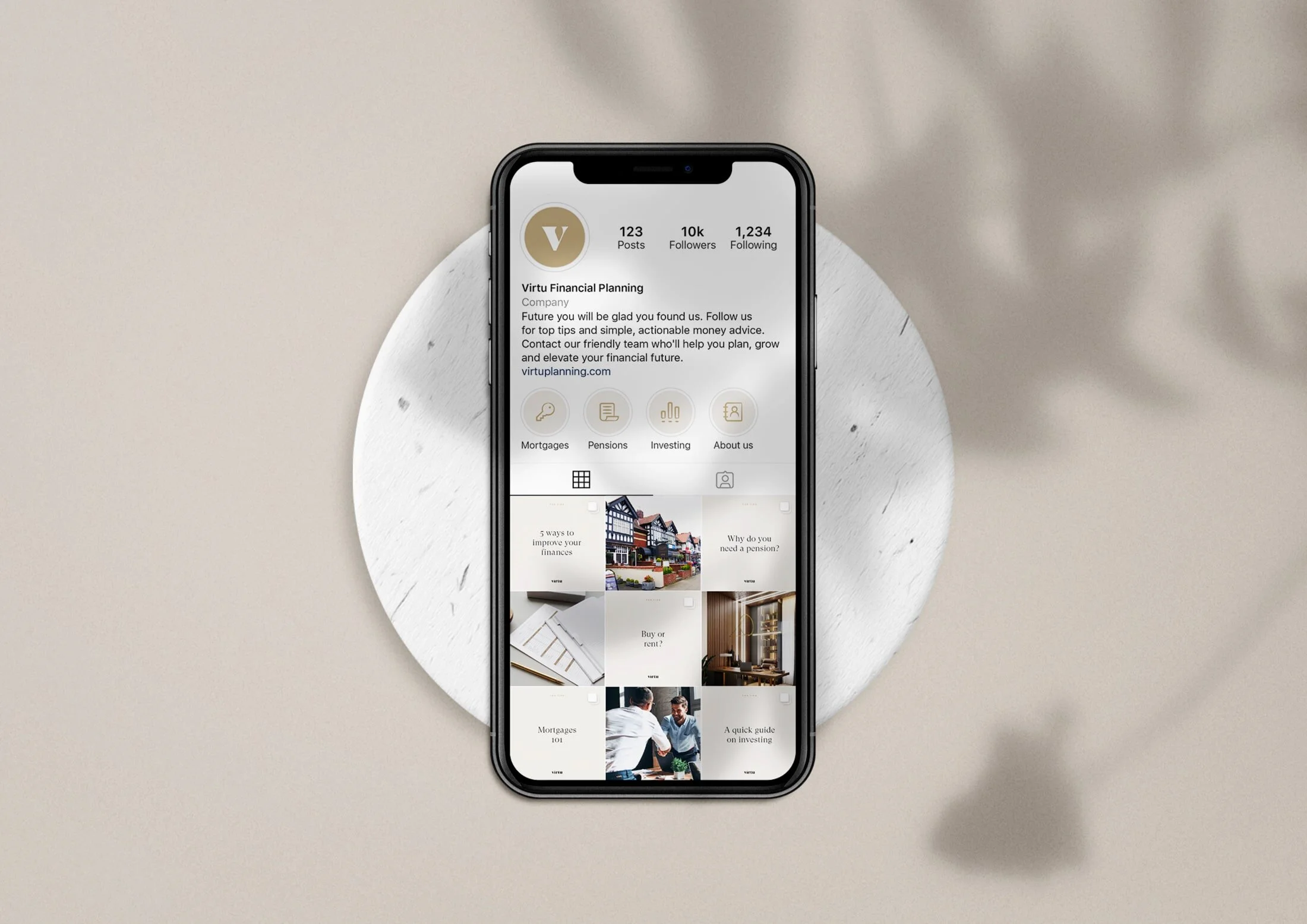
Virtu’s social media accounts are informative, engaging and welcoming. A jargon free zone, posts include helpful top tips, actionable advice, and glimpses into the Virtu experience.
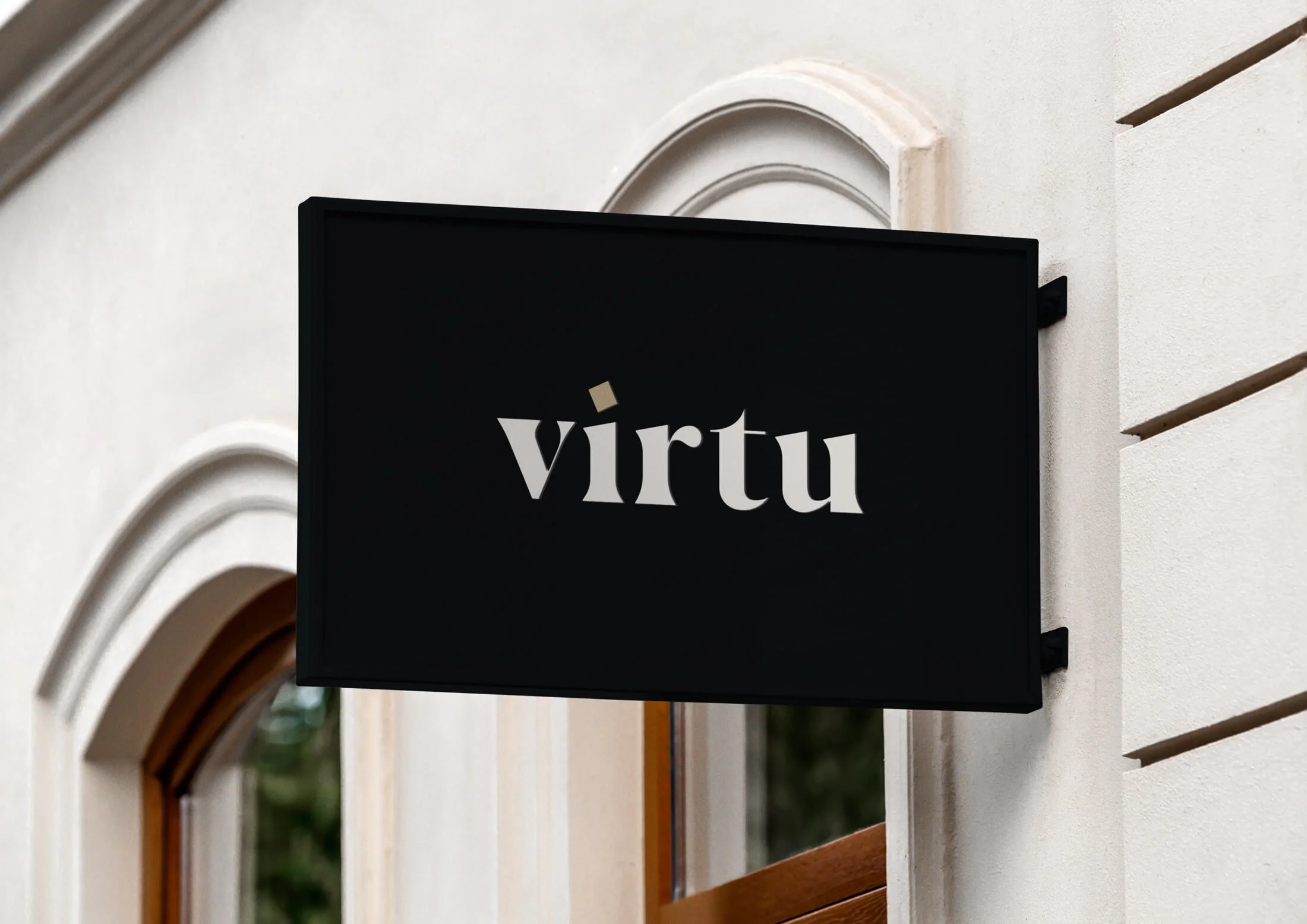
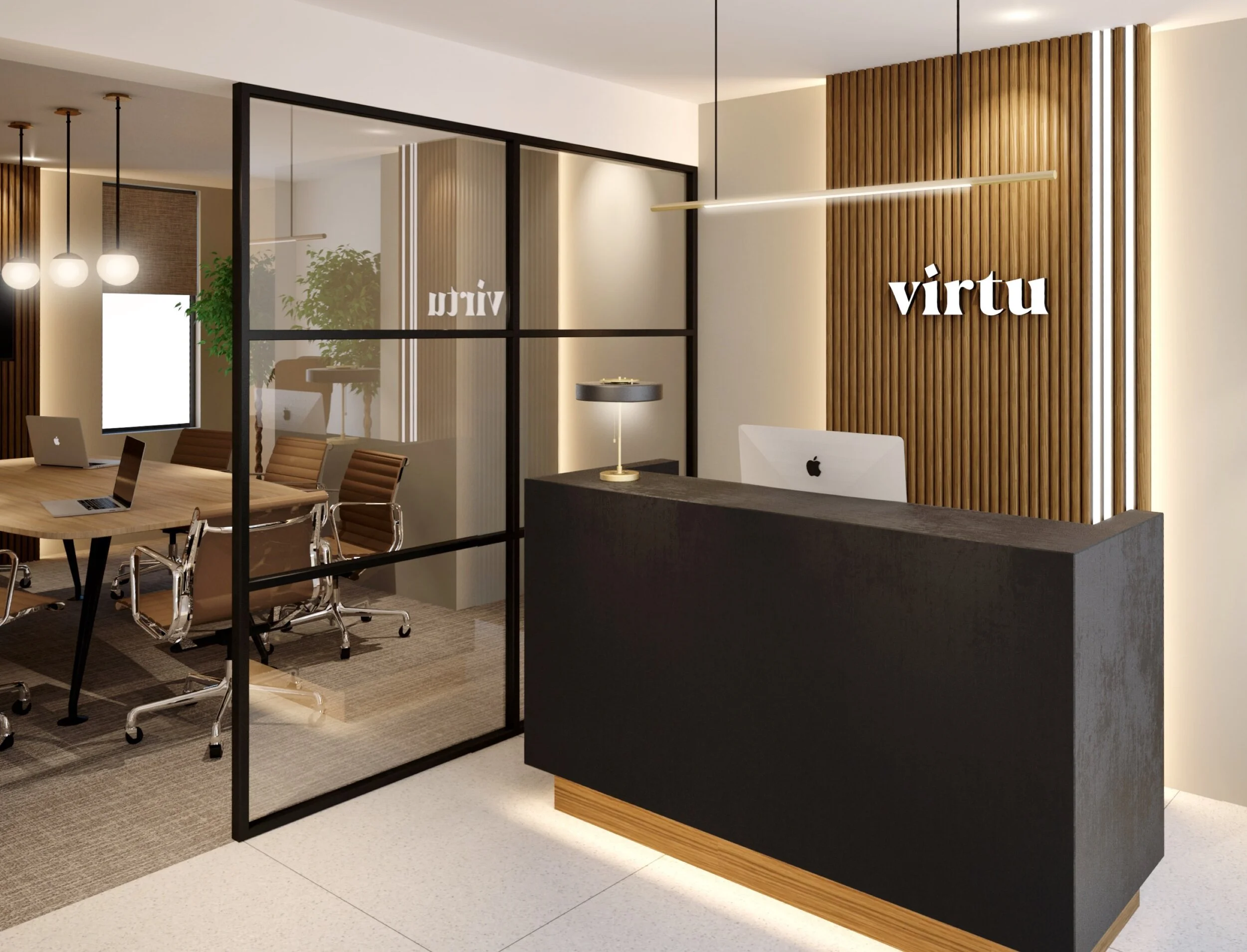
Office interiors are modern and sophisticated, with use of natural elements (plants, wood) to give life, warmth and a homely feel.
In the same way that the Virtu team are transparent and clear in all they do, the primary brand colours are black and white. Natural tones are used as secondary colours to bring in a warmth and approachability to the identity. Subtle gold can be used for small details to add an extra hint of luxe.

