Pots & Pithoi
A beautifully crafted identity for a renowned maker of classical pots.
- Brand strategy
- Creative direction
- Brand language
- Brand identity
- Brand collateral
- Website design
Clarity
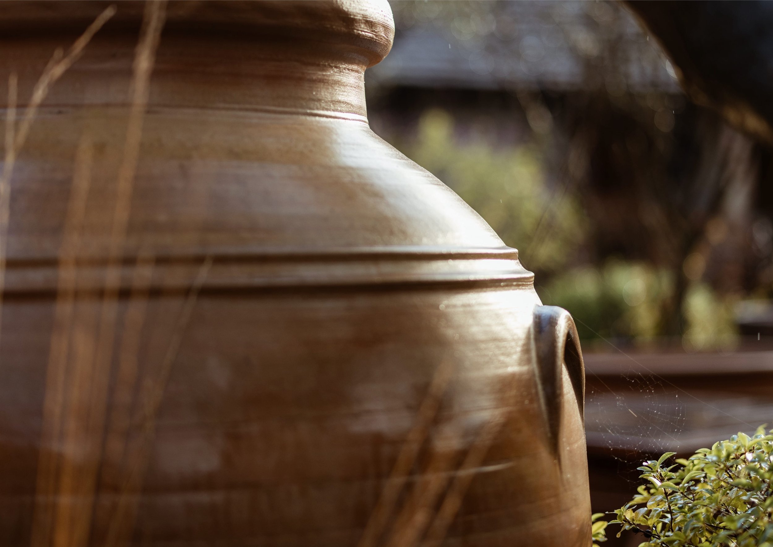
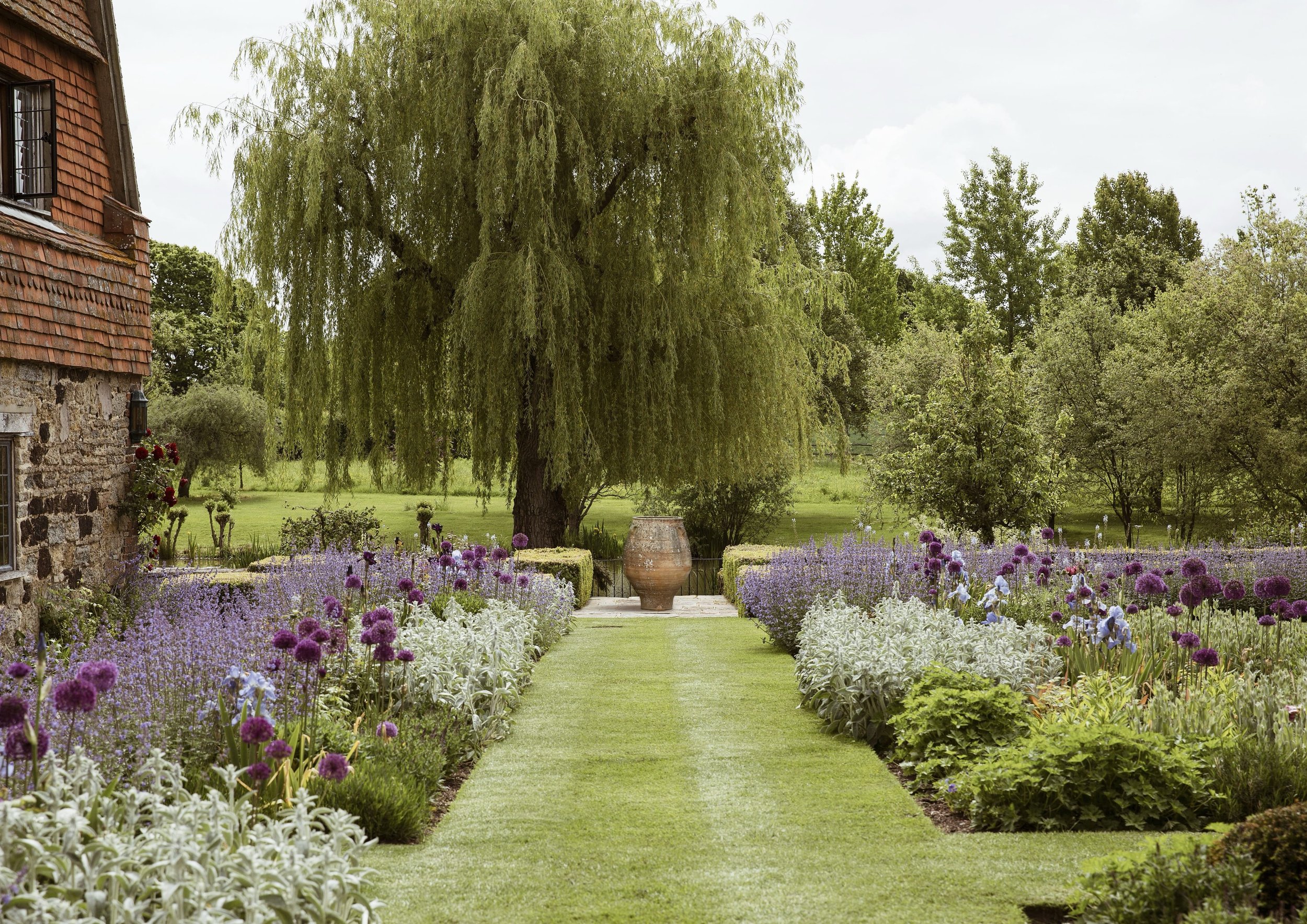
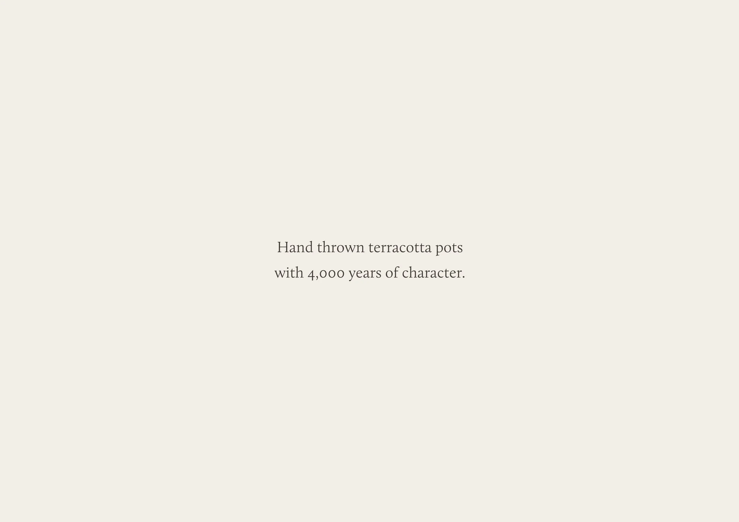
Pots & Pithoi is well known for its finest quality Cretan terracotta pots and planters, which grace some of the most outstanding gardens in the world.
Hand thrown by skilled artisans at their pottery in Crete, each pot bears the unique patina of a one-of-a-kind artisan product, appreciated by private customers and garden designers who want to make an elegant statement in their garden or outdoor space.
Focus
Pots & Pithoi’s existing brand communications didn’t communicate the prestigious positioning, and a lack of order and finesse was muddying the waters. Through our initial strategy work, we established a clear position in the market that was aligned with the business objectives, identified the most important customer groups, and defined the essence of the brand that would come through in all aspects of the brand from this point forward.
“Thank you so much for the remarkable transformation you have created for Pots & Pithoi. Not only for the website, but also for the complete rebranding of the business. You made the whole process an absolute pleasure and it was remarkable to see the development at each stage of the process.
You listened to our requirements from the beginning, and delivered so much more than we expected. We’re delighted with the end product and we look forward to continue working with you in the future.”
David Dodd · Owner
Brand essence
Prestigious
Reassuring quality and a quiet confidence.
Artisanal
True to a timeless craft.
Elemental
Inspired by the elements of nature.

Creative direction
Inspired by the pots themselves, the brand is a carefully considered balance of prestige and grounding. Quality, artistry and simplicity come through in all aspects, clutter doesn’t make the cut.
Colour palette
The colour palette is natural and pared back, inspired by the earthy browns and dusty whites of the pottery.
In Practice
We crafted custom letterforms and refined the spacing between characters for a perfectly balanced logo mark.
The strapline describes the artistry of taking a raw material from the ground, and transforming it through manual skill into something of value. The word “earth” speaks to the elemental side of the brand essence, while “refined” draws from the prestige side of brand.
The brand statement is intentionally simple and descriptive, allowing the true value of the product to shine through.
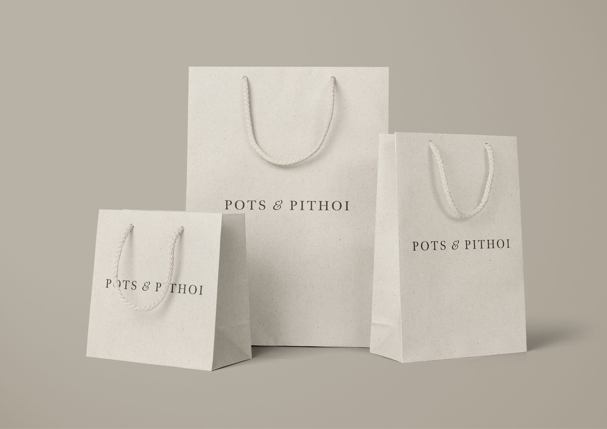
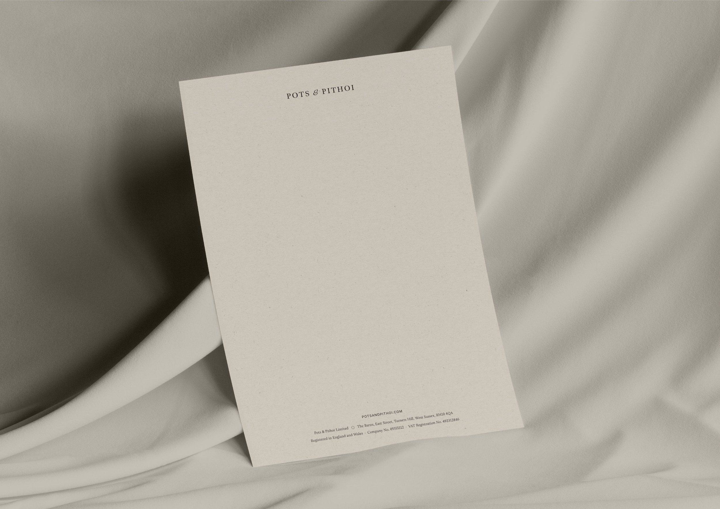
Papers and print finishes are tactile, high quality and well-crafted.

A custom sepia effect is used on craft images for an artisanal feel. The composition is intimate and includes a sense of motion and work-in-progress.
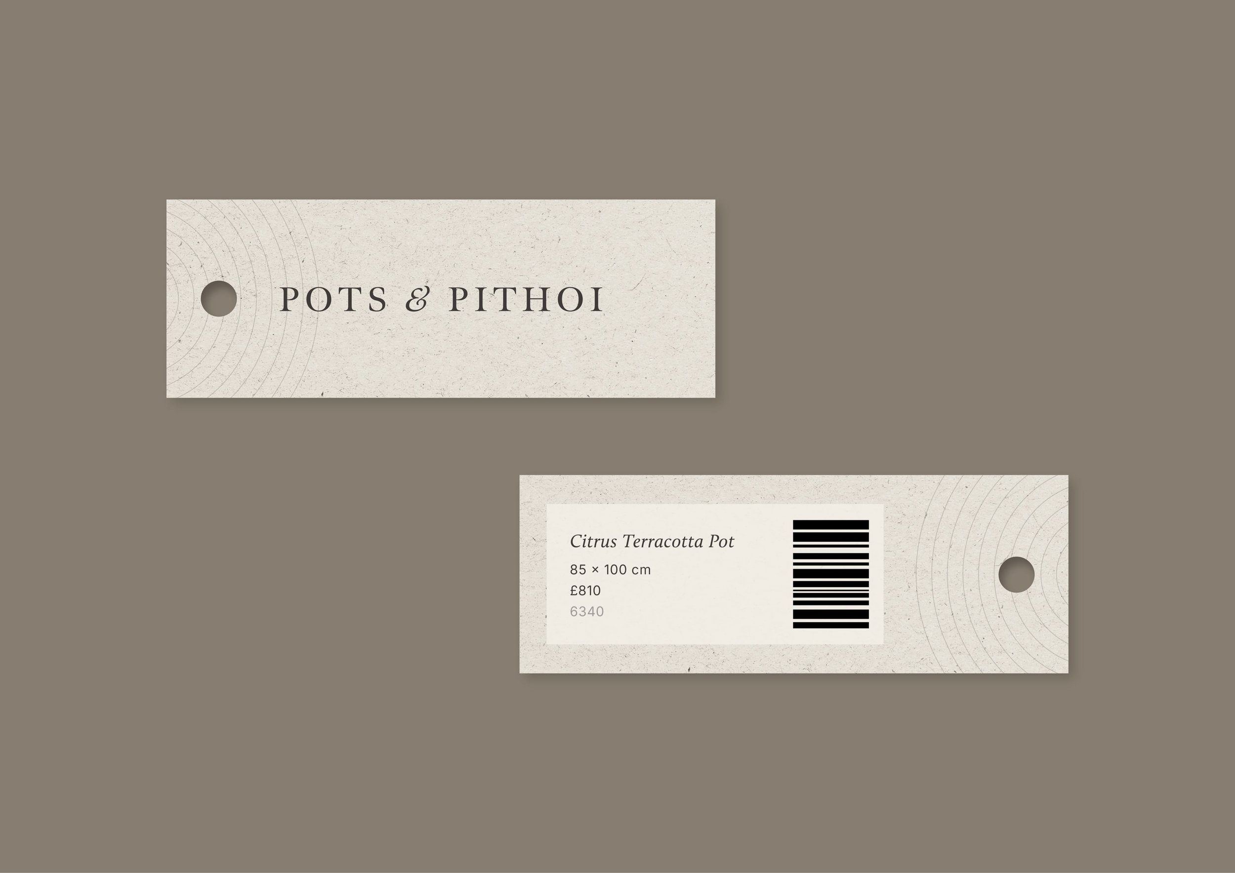
The concentric circles motif is inspired by ancient labyrinths, the turning of a potter’s wheel, and ripples on water.
Embossing is used to denote the impressionable quality of clay.

An impression is made into each pot by the maker, using a new brand stamp.
Website design
The next step was to design and build a new website on the Shopify platform. As part of this process, we introduced a new brand architecture and product taxonomy for over 300 products which informs future buying, categorising and uploading of products. Visitors to the site can now browse clear collections, with refined searching, sorting and filtering functionality. We migrated the client’s in-store POS system to the same platform to create one streamlined order, customer and stock management system.
A naming convention was introduced, so that all products now have a single Greek name, bringing a sense of calm and order to the brand.
Product options such as size or special features can now be selected on the product page.

The prestige and artisanal elements of the brand are reinforced on every product page.
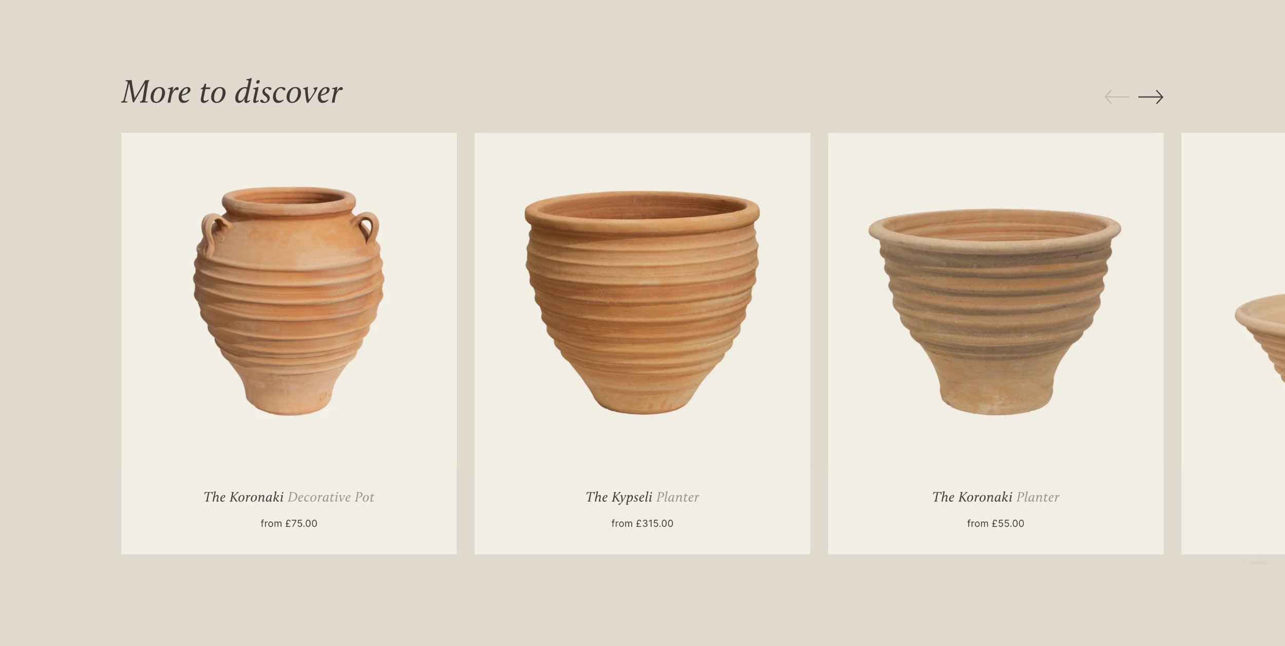
We tailored the suggested products to include the most relevant related products.

A unified website and POS system allows customers to use both digital and physical gift cards, in-person and online.
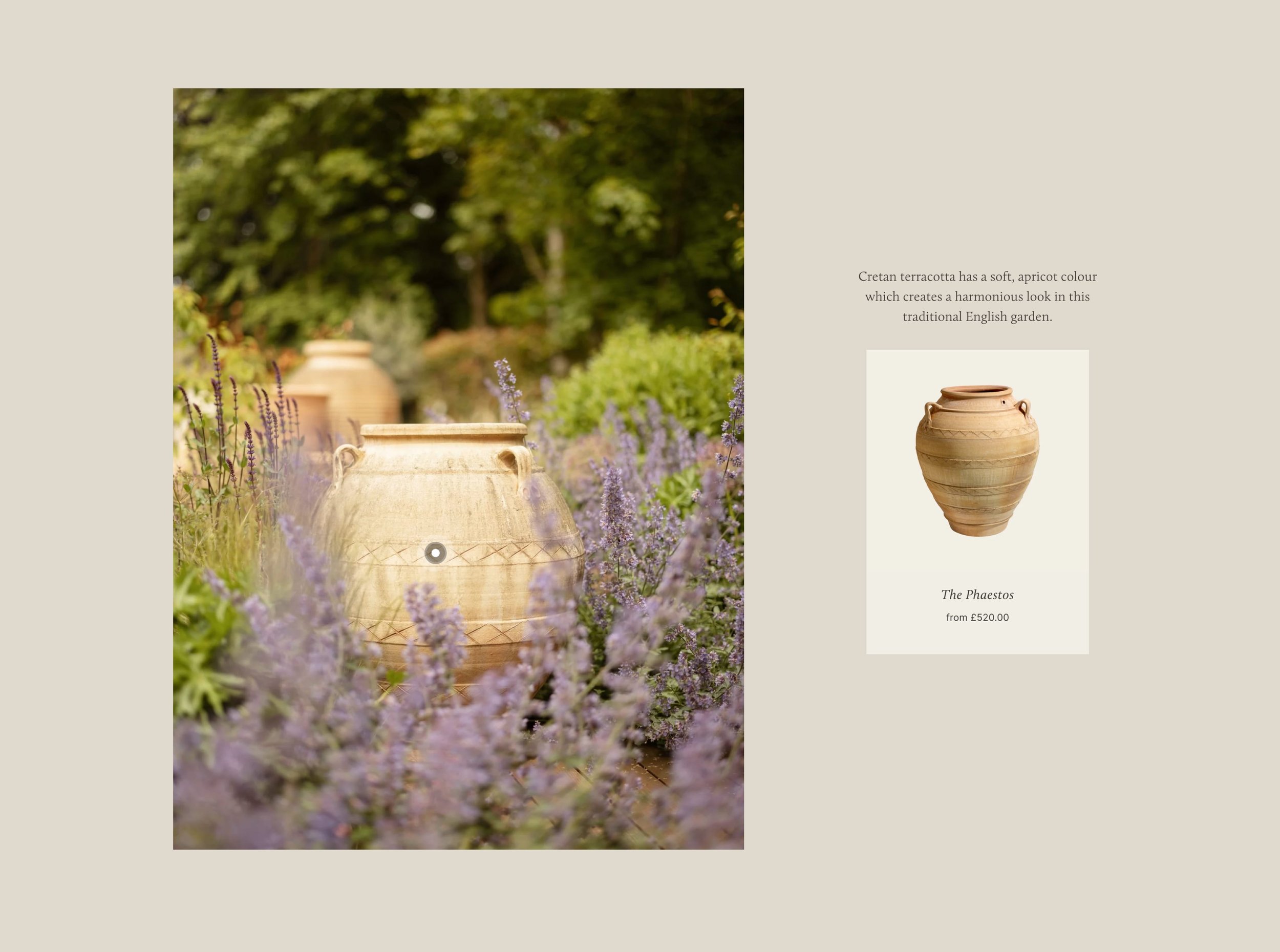
An inspiration gallery links visitors back to relevant shopping pages.
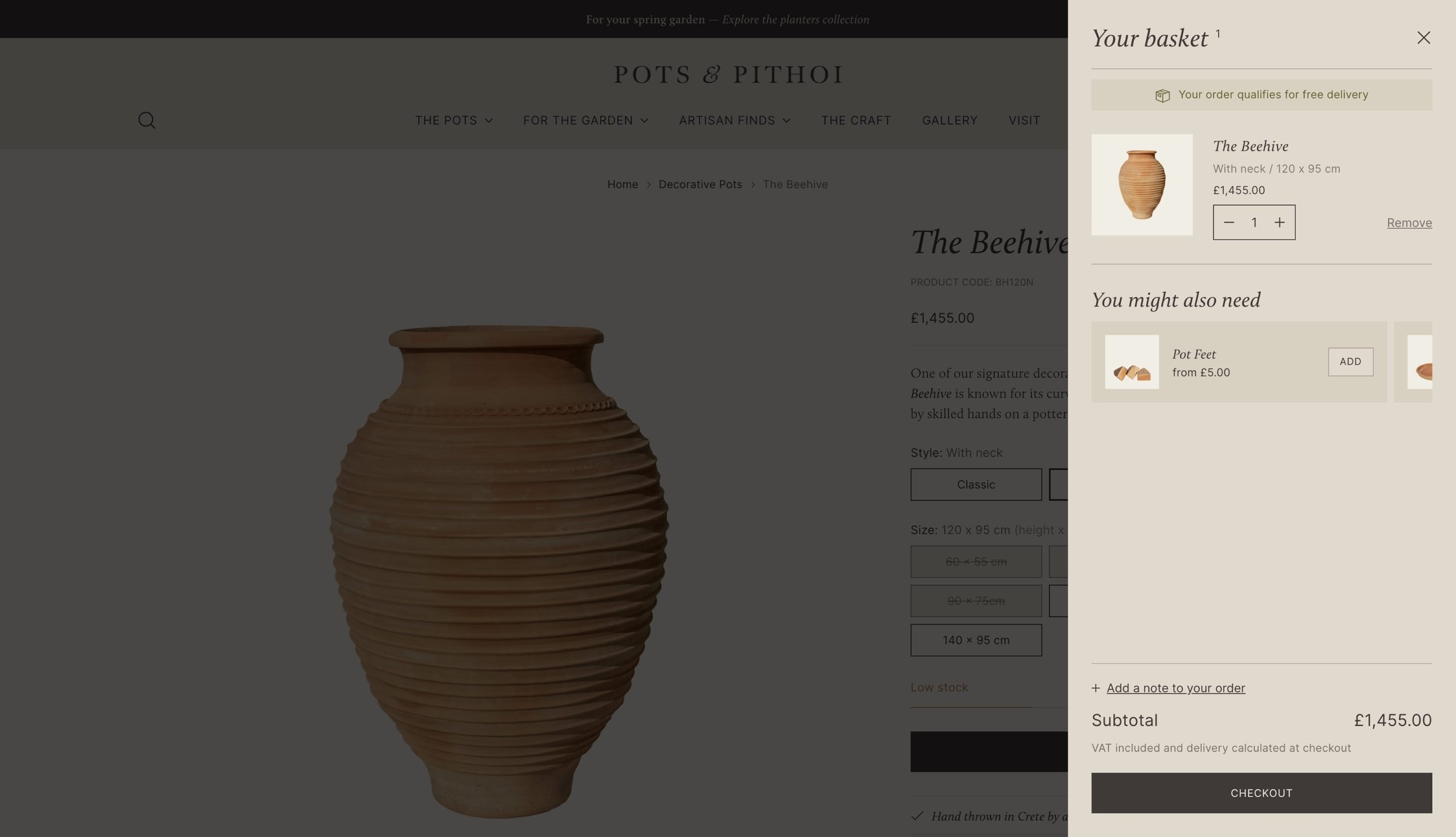
Basket messaging increases average order values by promoting free delivery over a specific amount, as well as promoting up-sell products such as pot feet, stands and more.
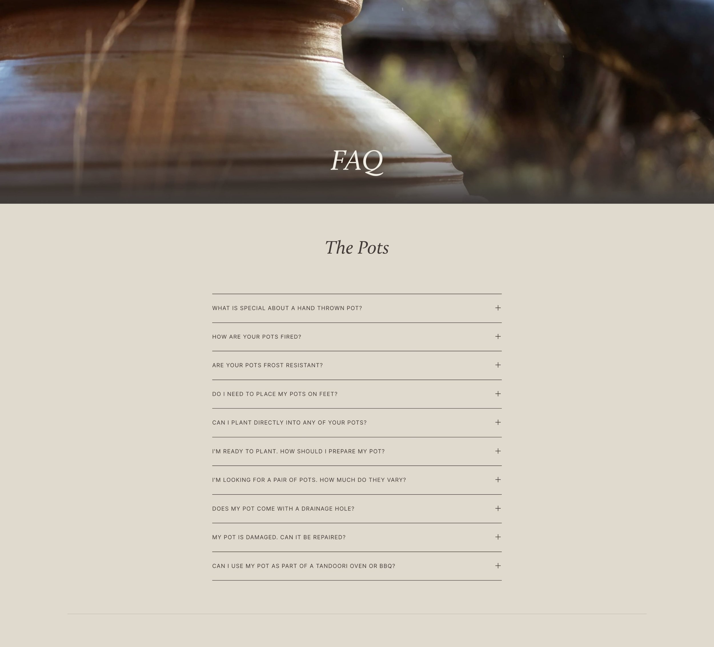
Helpful FAQs are referenced throughout the site to reduce barriers to sales.
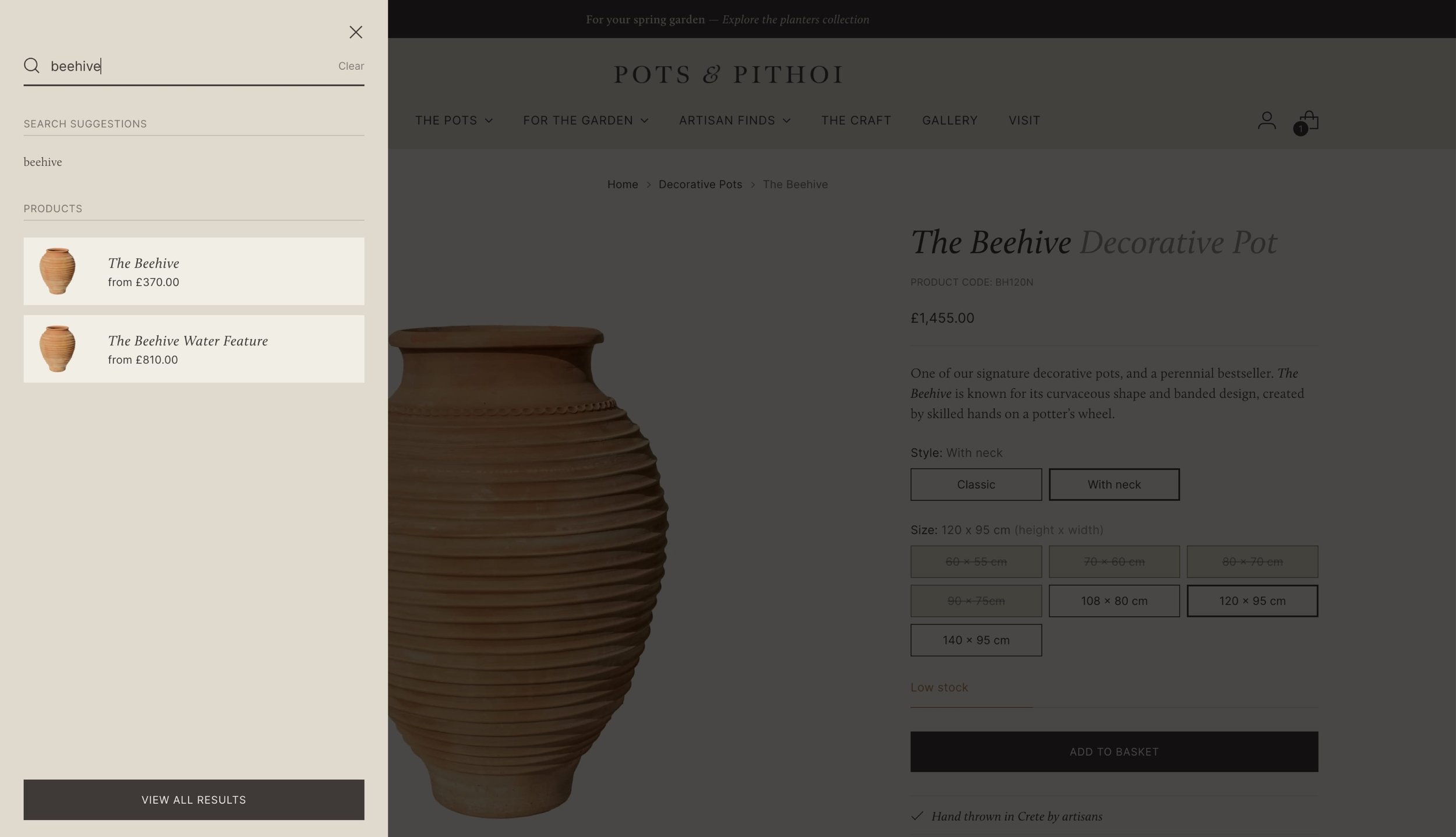
By introducing a clear product taxonomy, search results can return the most relevant related products.
Summary
The new website delivers a refined brand and shopping experience that powers the business model and reflects the true prestige of the brand.
