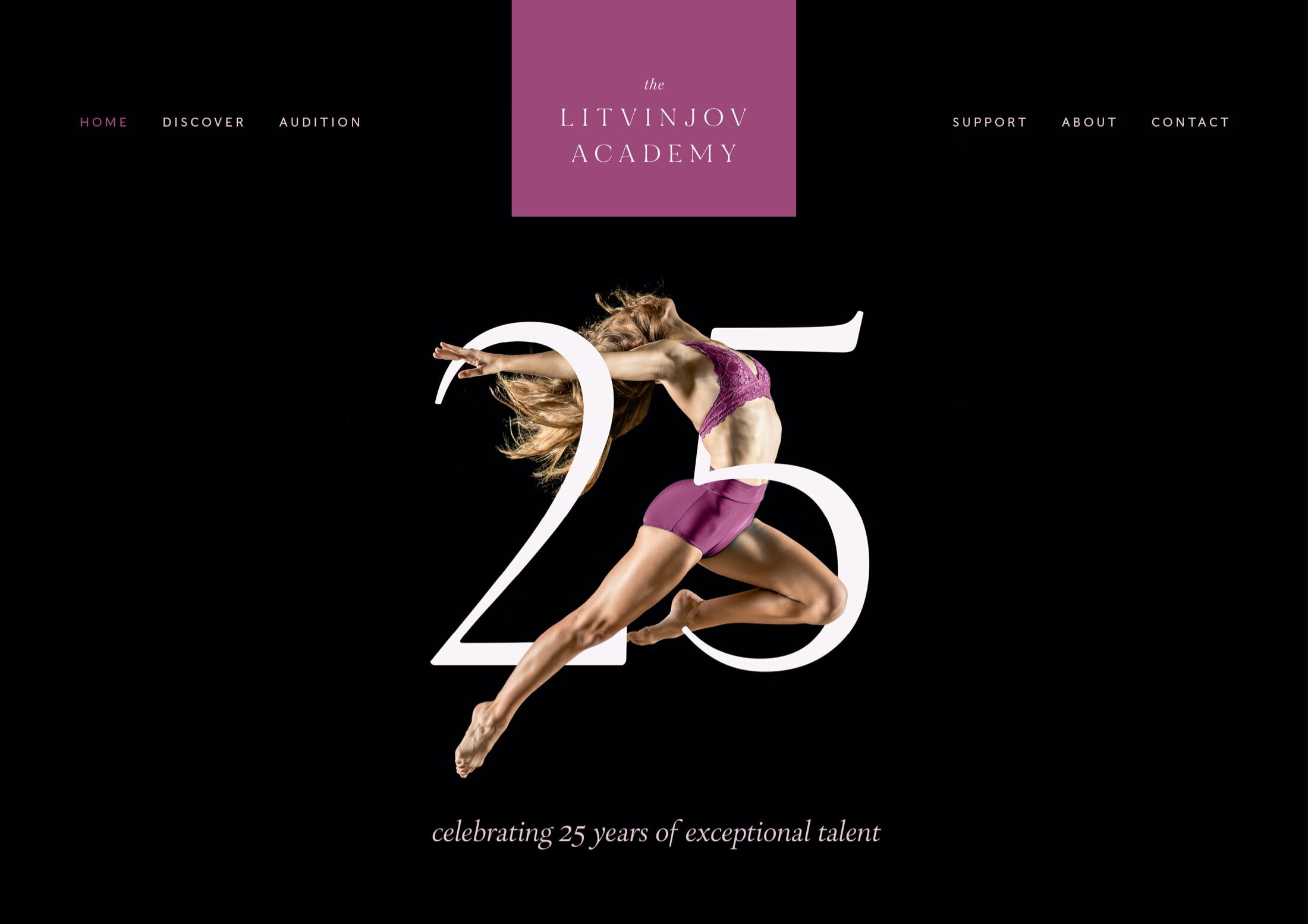
The Litvinjov Academy
A prestigious, flowing identity full of movement, drama and elegance.
- Brand design
- Website design

Clarity
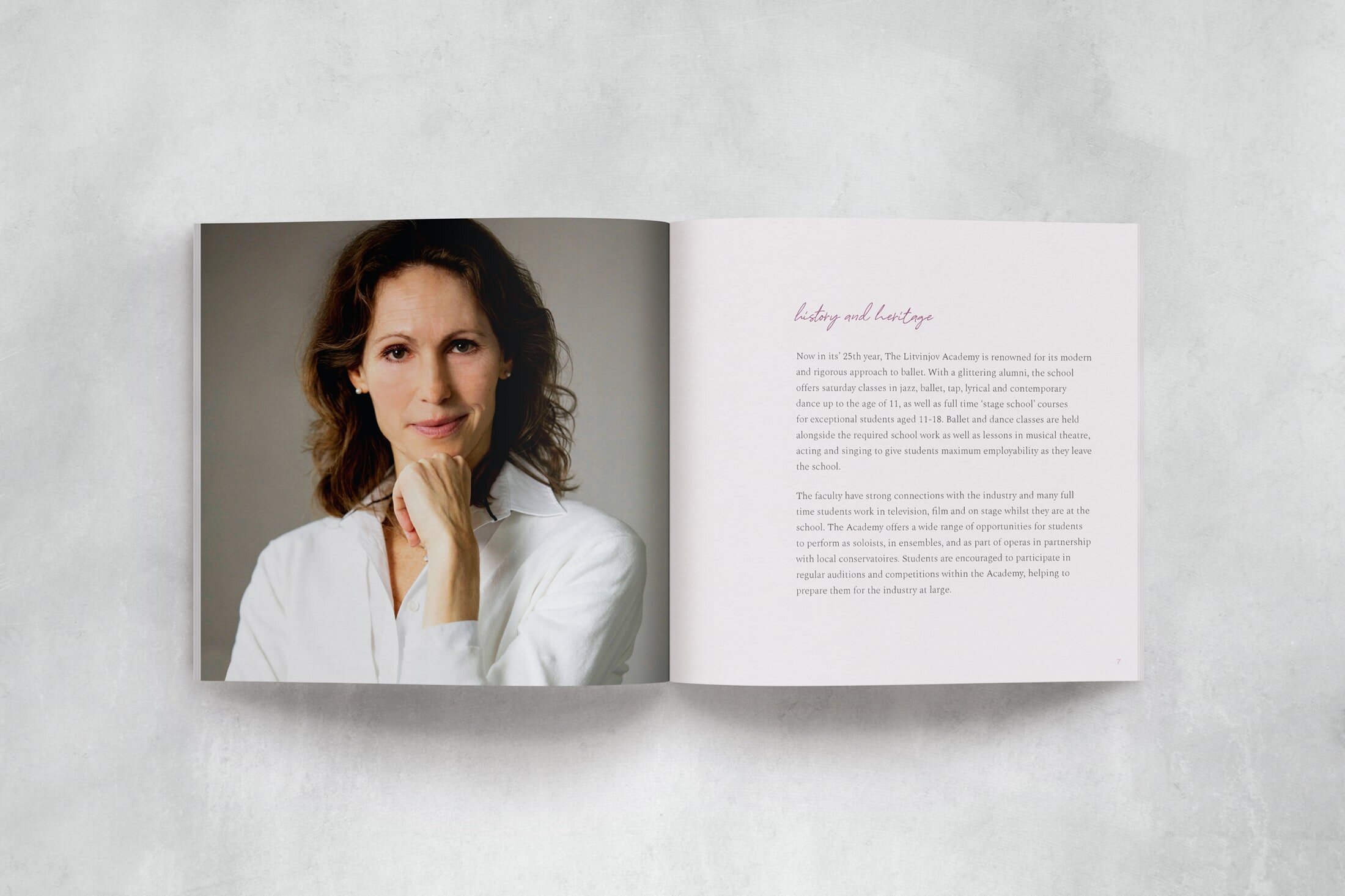
Guiding and nurturing exceptional talent, The Litvinjov Academy prepares students for the industry at large, with a focus on individuality, employability and passion for the arts. Now in its 25th year, the academy is renowned for its modern and rigorous approach to ballet and boasts a glittering alumni.

Brand essence
Prestigious · Disciplined · Aspirational
Creative direction
Inspired by the dynamism of dance, the contrast of the stage, and the delicate, flowing lines of ballet and contemporary dance, The Litvinjov Academy brand is prestigious, disciplined and aspirational.
The brand colour palette is focused and refined, with colours that are inspired by the light and dark of stage light, delicate feather costumes, and ballet slipper pink.
“Your sheer commitment to your vision is inspirational. It’s incredible how much thought you’ve put into this. You’ve really captured the essence of what the business is all about.”
Fiona Humberstone · The Brand Stylist
Colour palette
In Practice
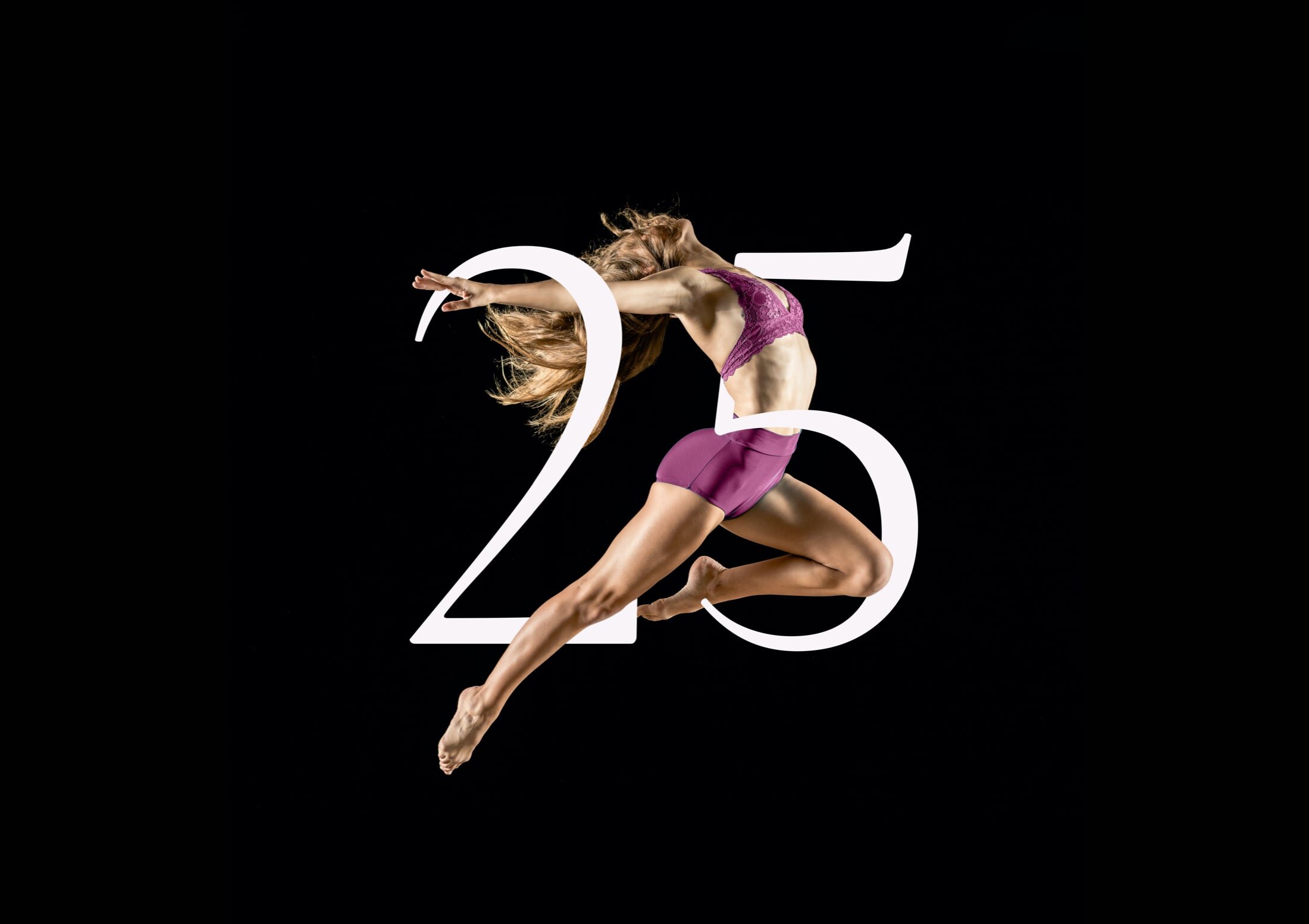
Celebrating 25 years of The Litvinjov Academy, the dancer and 25 typography combine with one another, in a dance-like fashion.
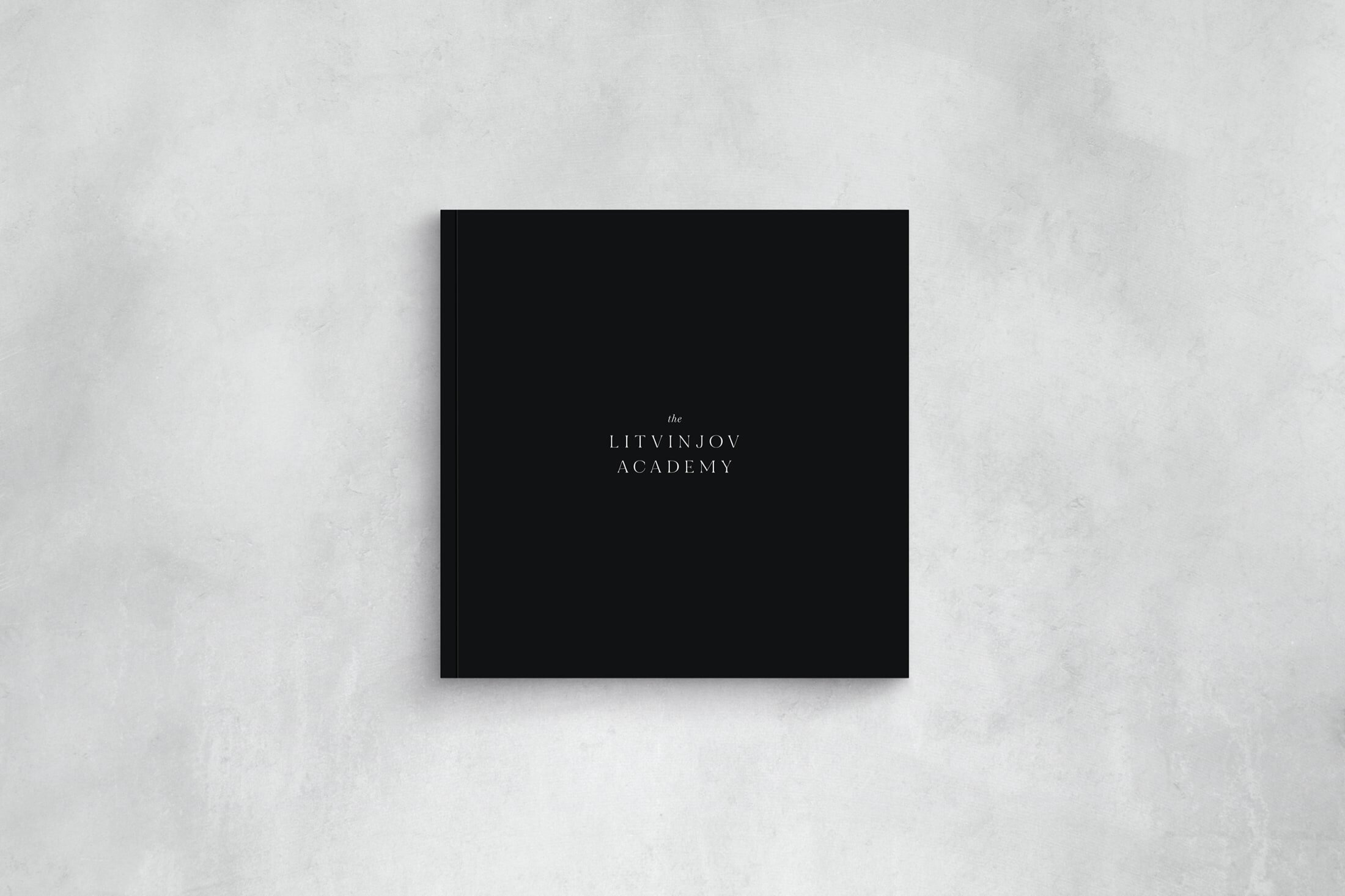
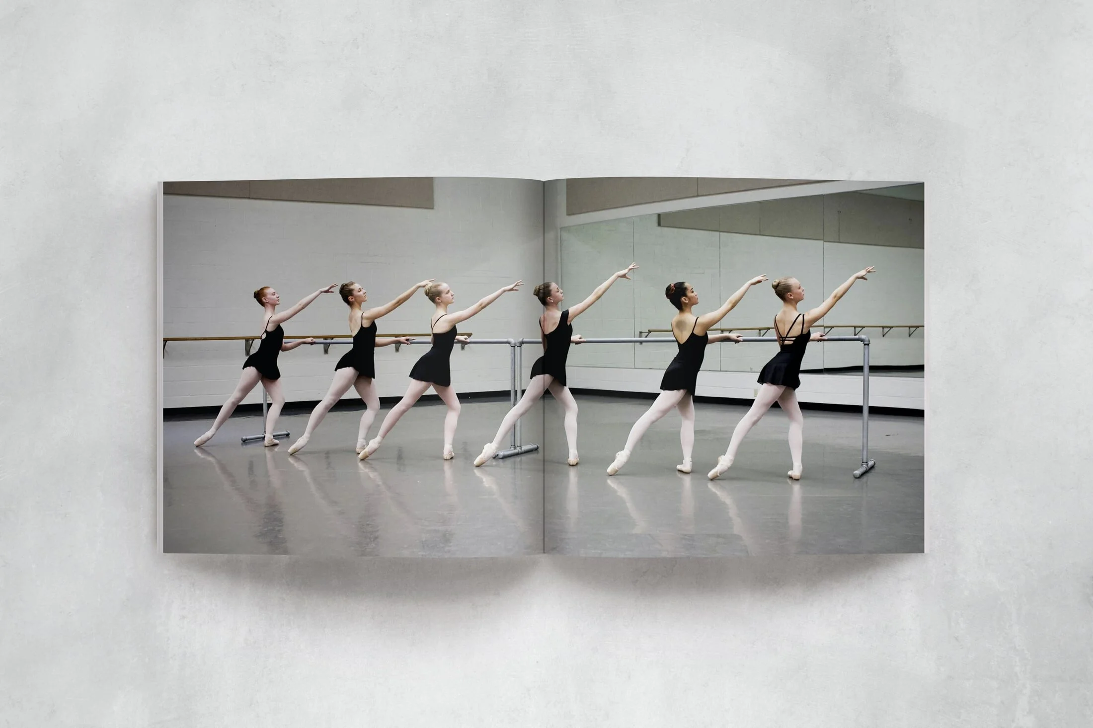
In a perfectly bound square book, the academy prospectus is likely to be one of the first experiences a parent or student will have with the academy, and so, first impressions are everything.

With a matte laminated cover, and beautifully textured GF Smith paper for the inside pages, the prospectus sets the tone for the prestigious, disciplined and aspirational experience that a student and parent will have when interacting with the academy.

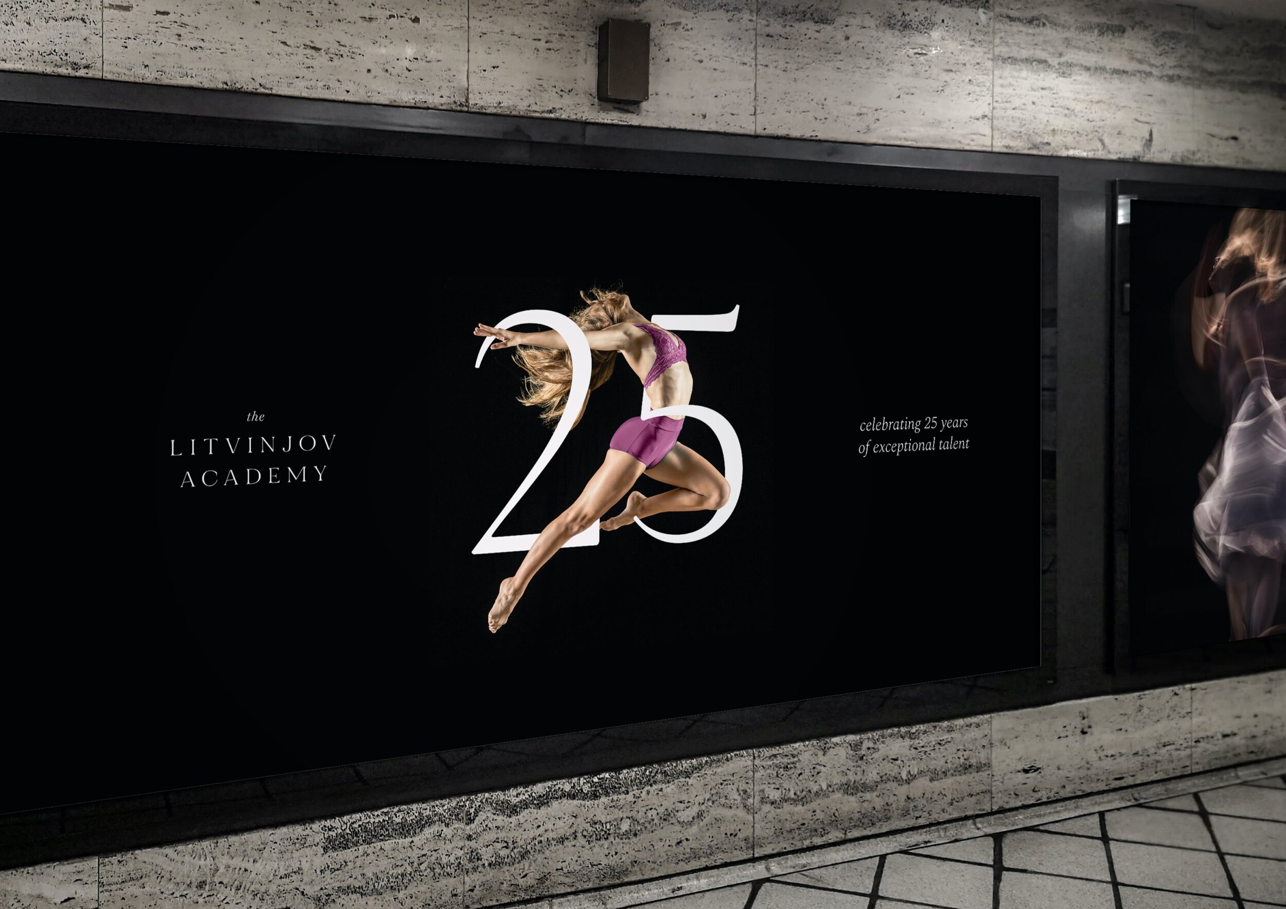
The dynamic and creative imagery is elegant, aspirational and refined and is bound to turn heads when used in selected industry magazines, external advertising and as huge posters within the academy buildings.