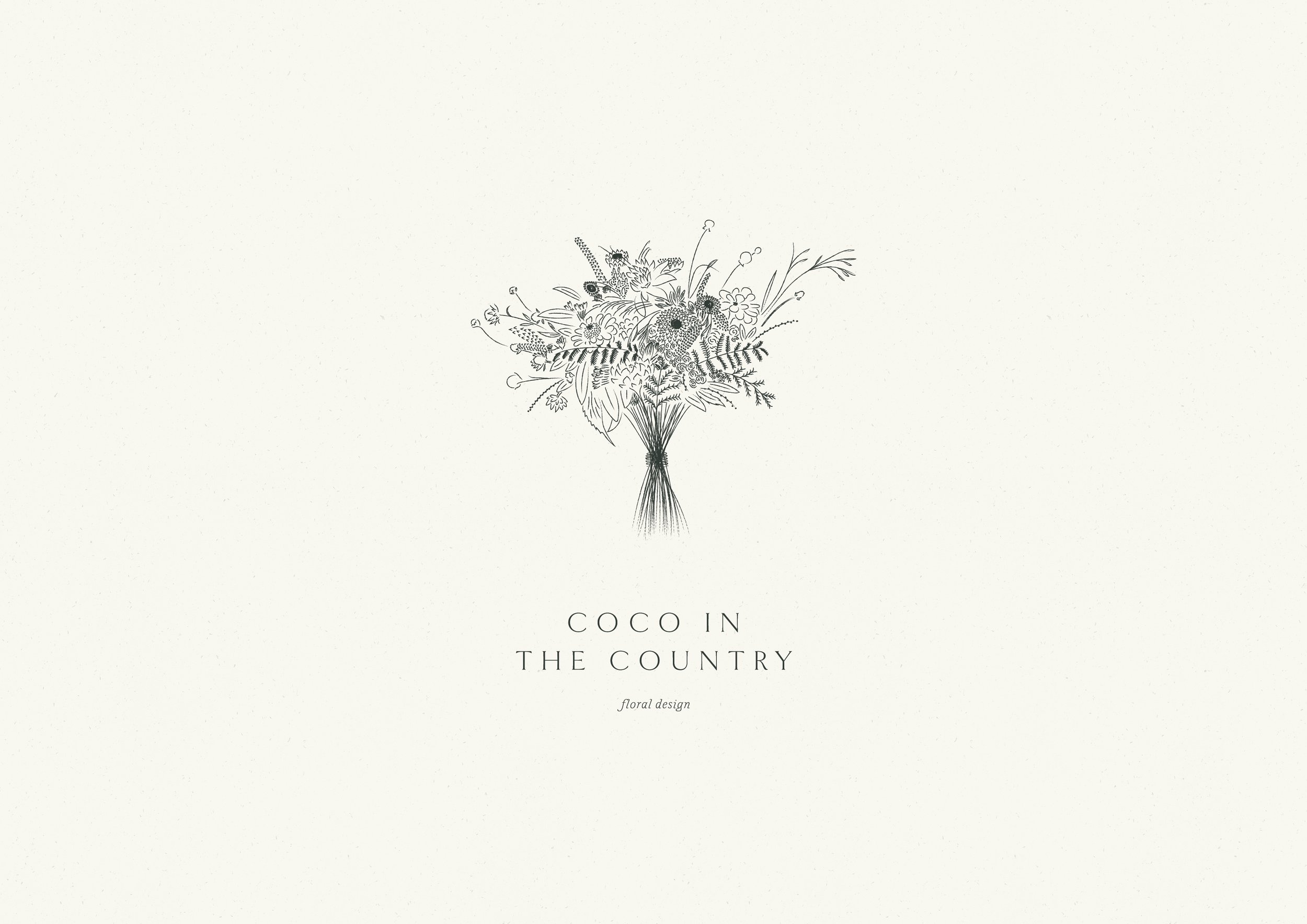
Coco in the Country
A refined, romantic brand for a leading floral design duo.
- Creative direction
- Brand identity
- Brand language
- Website design

Clarity
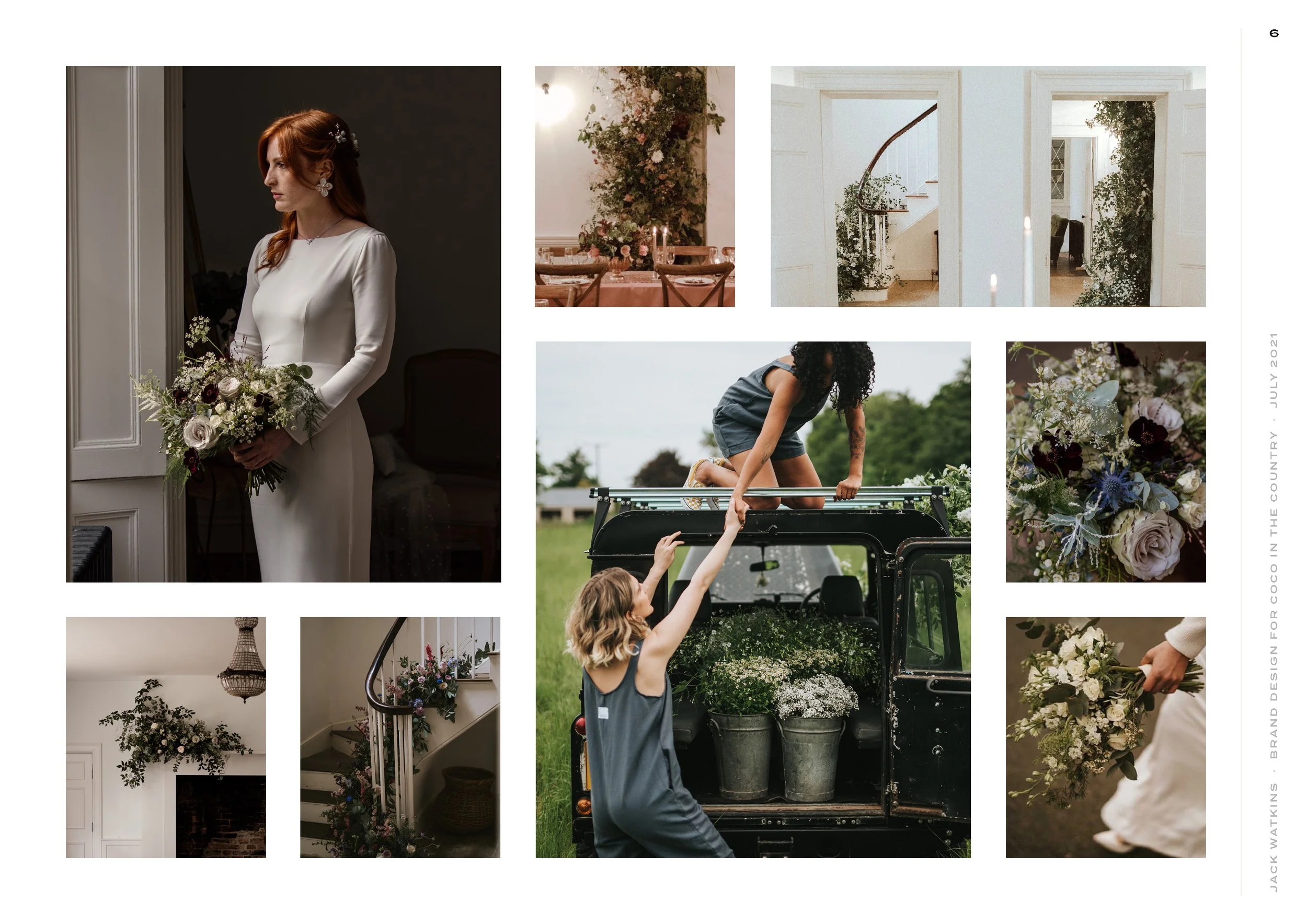
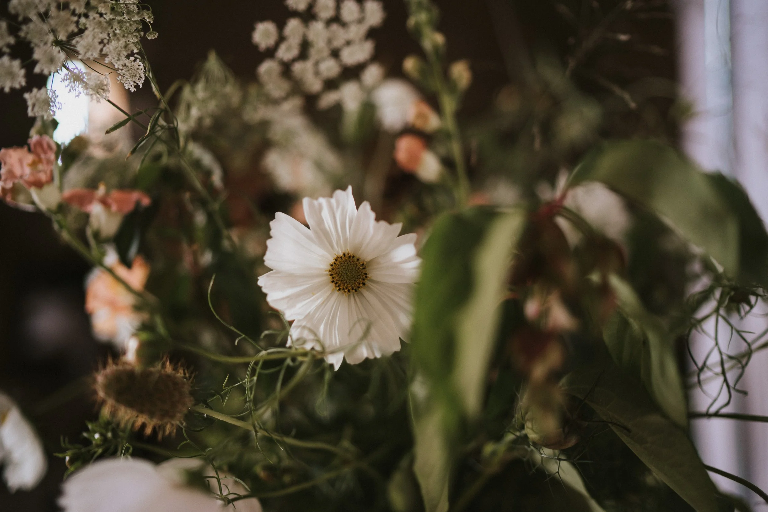
Sought out by name for their inimitable, distinctive and recognisable style, Coco in the Country are a leading floral design duo, with a natural, wild, sustainable and seasonal approach to flowers. Lucie and Kim work on large-scale, design-led weddings and events, where their installations set the scene, create a sense of wonder, and truly make an impact for their stylish clients and guests.
Creative direction
Exquisite, natural and personal, the Coco in the Country brand aesthetic is a carefully considered balance of beauty and restraint. It has elevation and impact, and does justice to Lucie and Kim’s beautiful work and position within the industry, whilst also maintaining a balance between visionary floral designers and importantly, the approachable, lovely humans that they are too.
Brand essence
Exquisite · Natural · Personal
“It’s like a dream come true. You are the very, very best Jack. You’ve given us so much more than a website and new branding. You’ve given us clarity on what we want our business to be, a revived passion for what we do, and more than anything, belief in our ability. Thank you from the bottom of our hearts.”
Lucie & Kim, Floral Designers
Colour palette
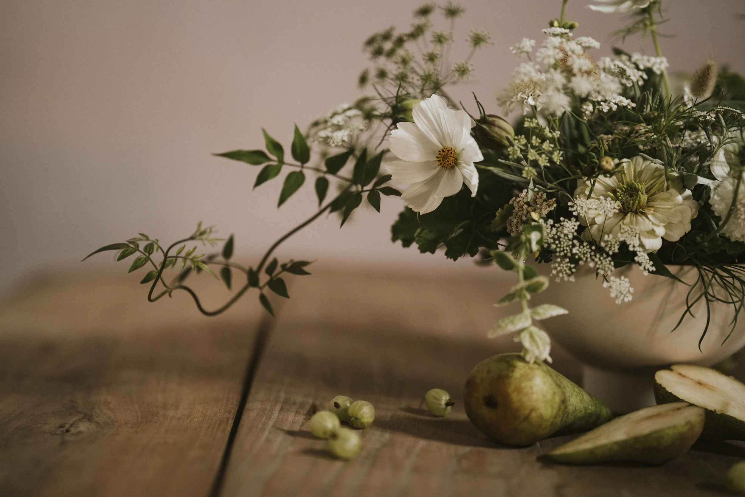
Providing an understated yet solid foundation for their work to sit alongside, the brand colour palette is soft, delicate and muted, and inspired by the natural world.
As per colour psychology, subtly warm whites are sophisticated, calming and pure. Deep greens are grounding, and evoke balance, harmony and aliveness. Sage green brings a freshness to the palette.
In Practice
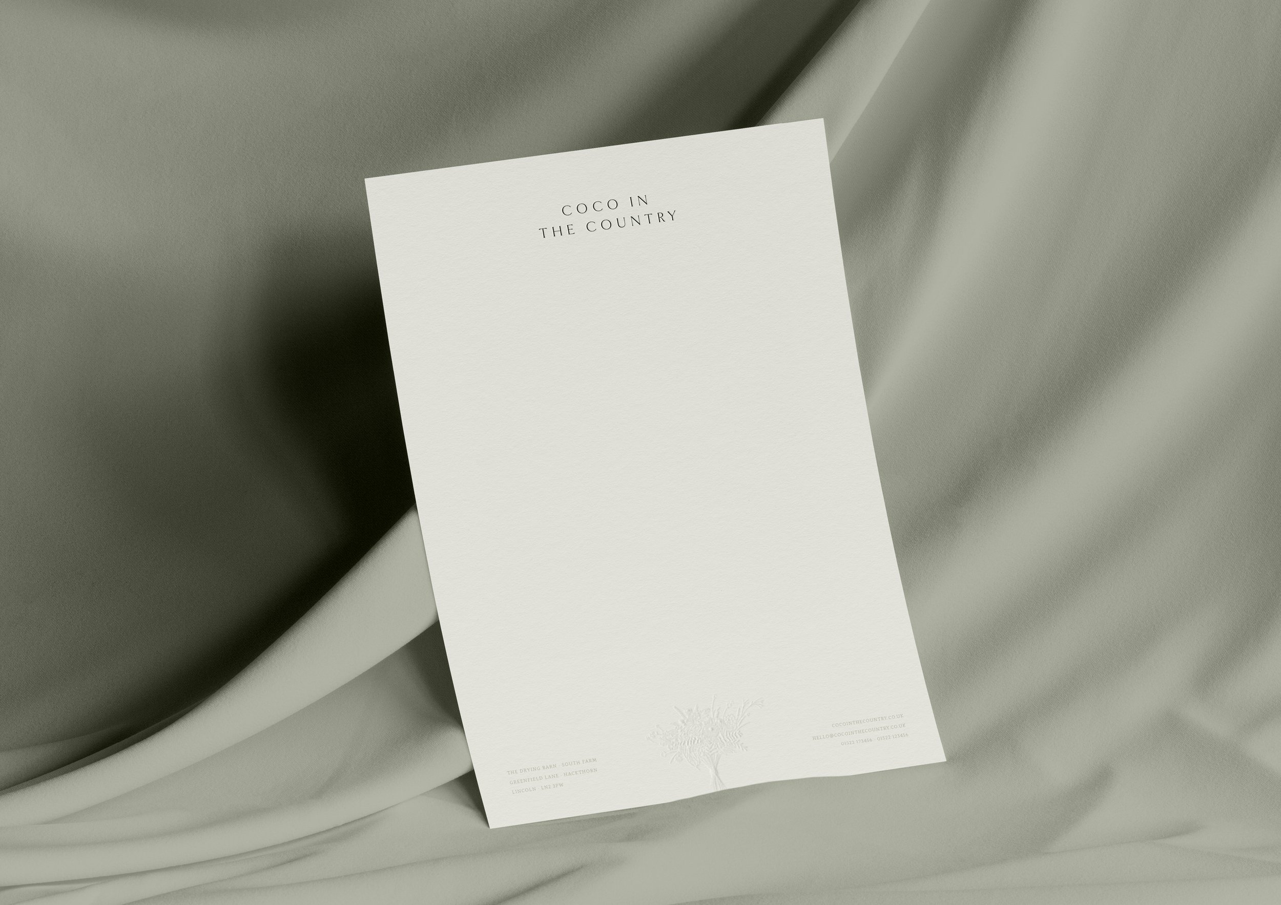
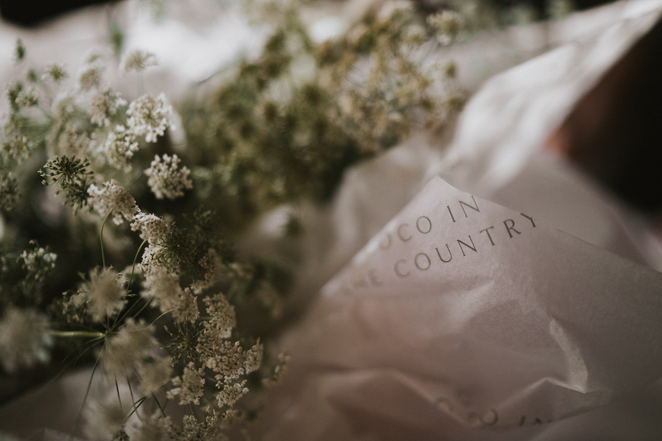
Layouts are carefully balanced and exquisitely arranged. Paper is uncoated, tactile and of an extremely high quality.
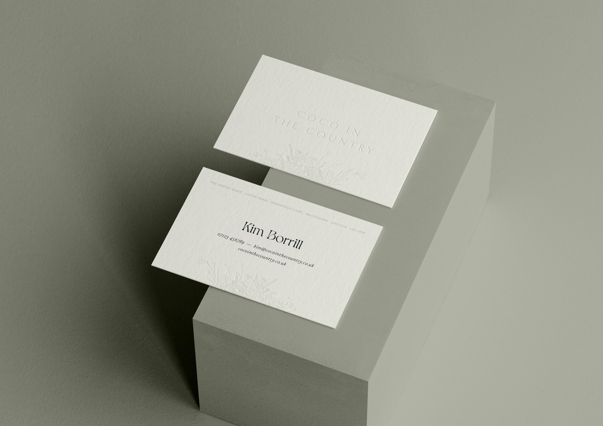
GF Smith's "Natural" Colorplan paper is used in varying weights for all brand stationery. Blind embossing is used as a subtle yet elegant special finish.

A series of elegant greeting cards and postcards featuring the bespoke brand illustrations were also created — coming soon to the Coco in the Country online store.
Another product coming soon to the Coco in the Country online store.
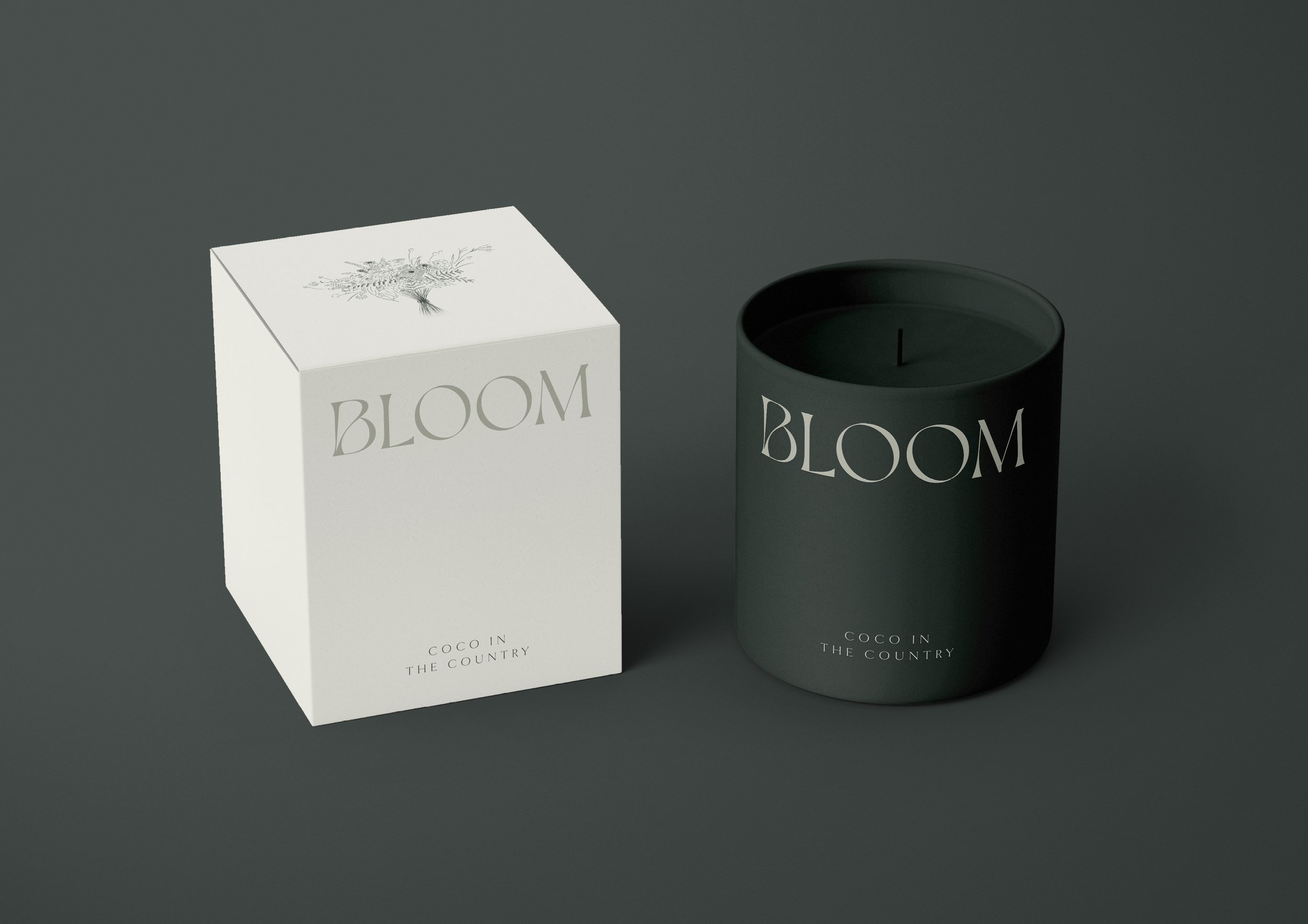
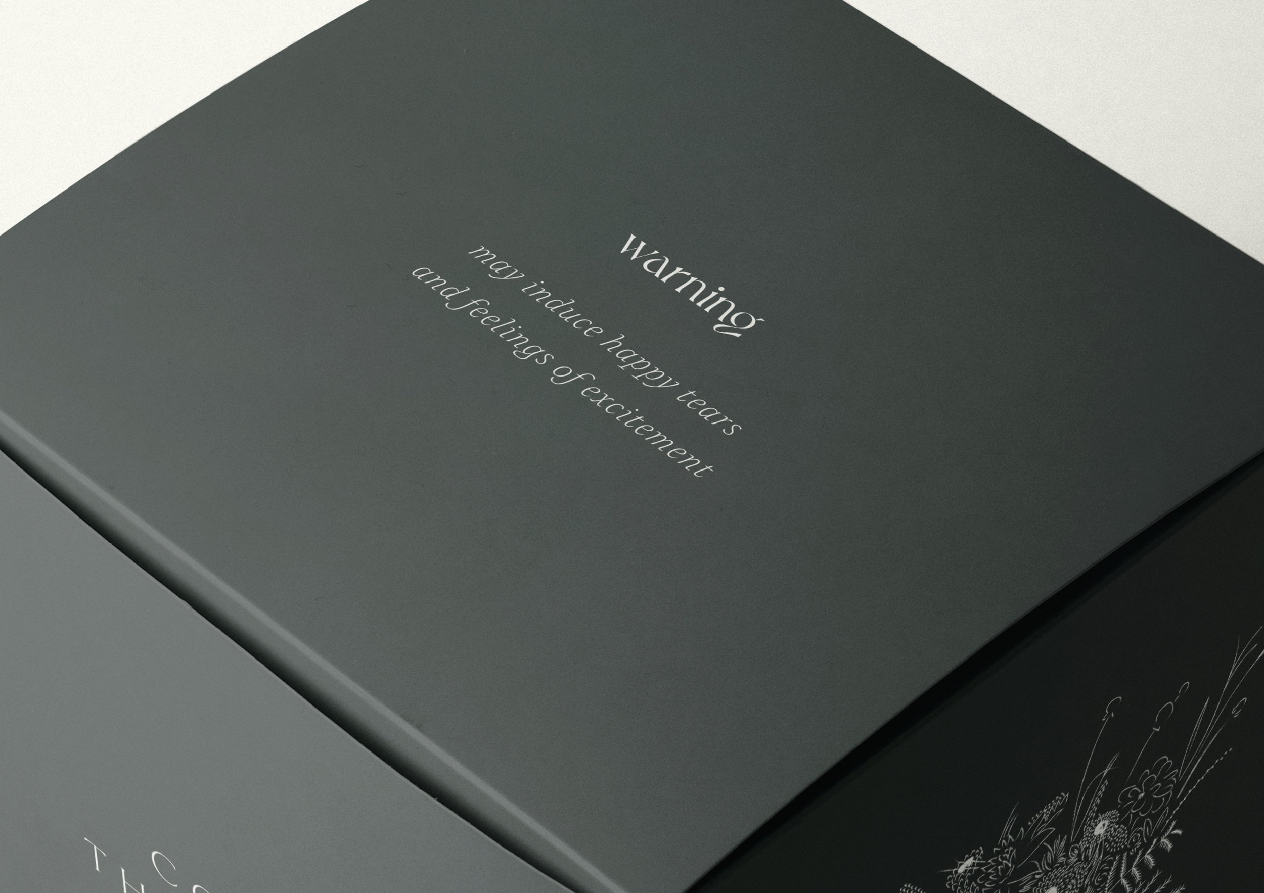
As part of the brand identity development process, I love to dream up new ways for the brand identity to be used, in order to inspire, uplift and excite the client.

Each and every element of the client experience was thought through, in order to elevate every moment. This reusable box is used to present the bride's bouquet, creating a sense of anticipation and excitement, as well as being sure to delight too!
Always sure to raise a smile and make their clients feel like they've found the one, the brand's tone of voice is confident, assured and yet friendly too.
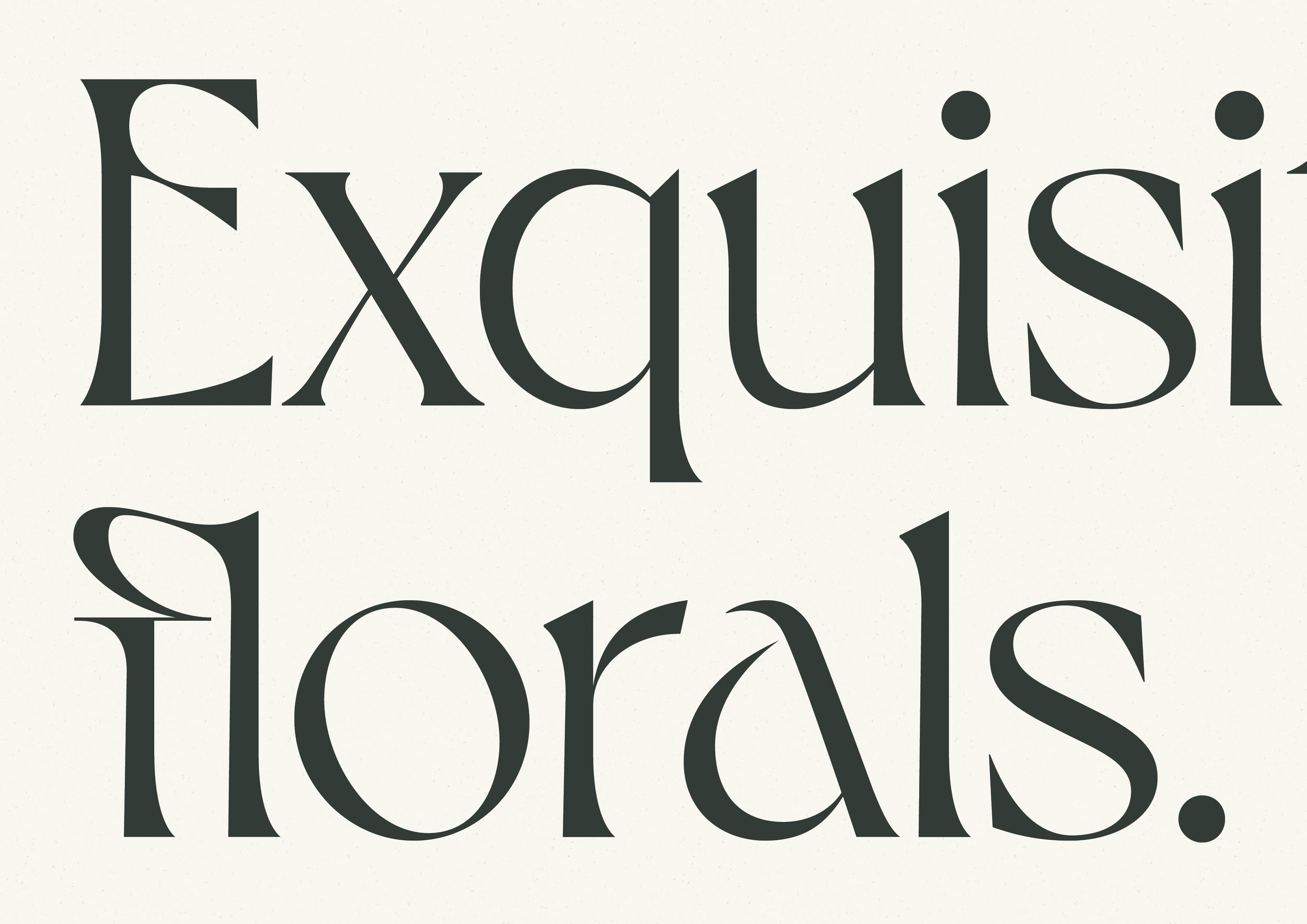
Typography is formal and elegant, with plenty of whitespace used to give the elements room to breathe.
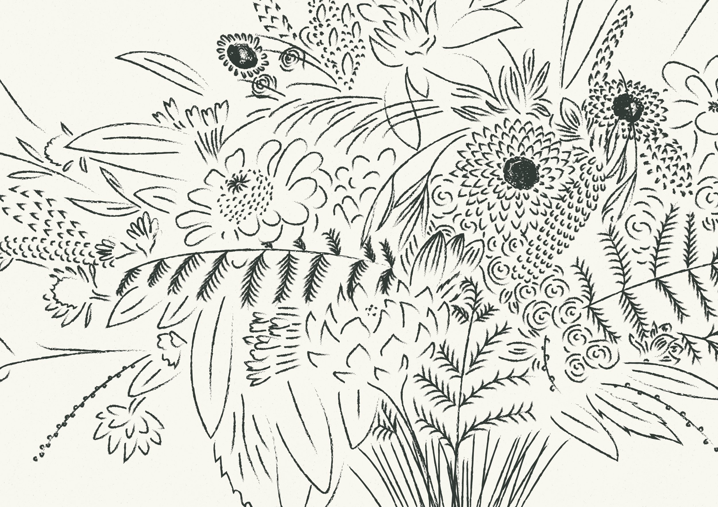
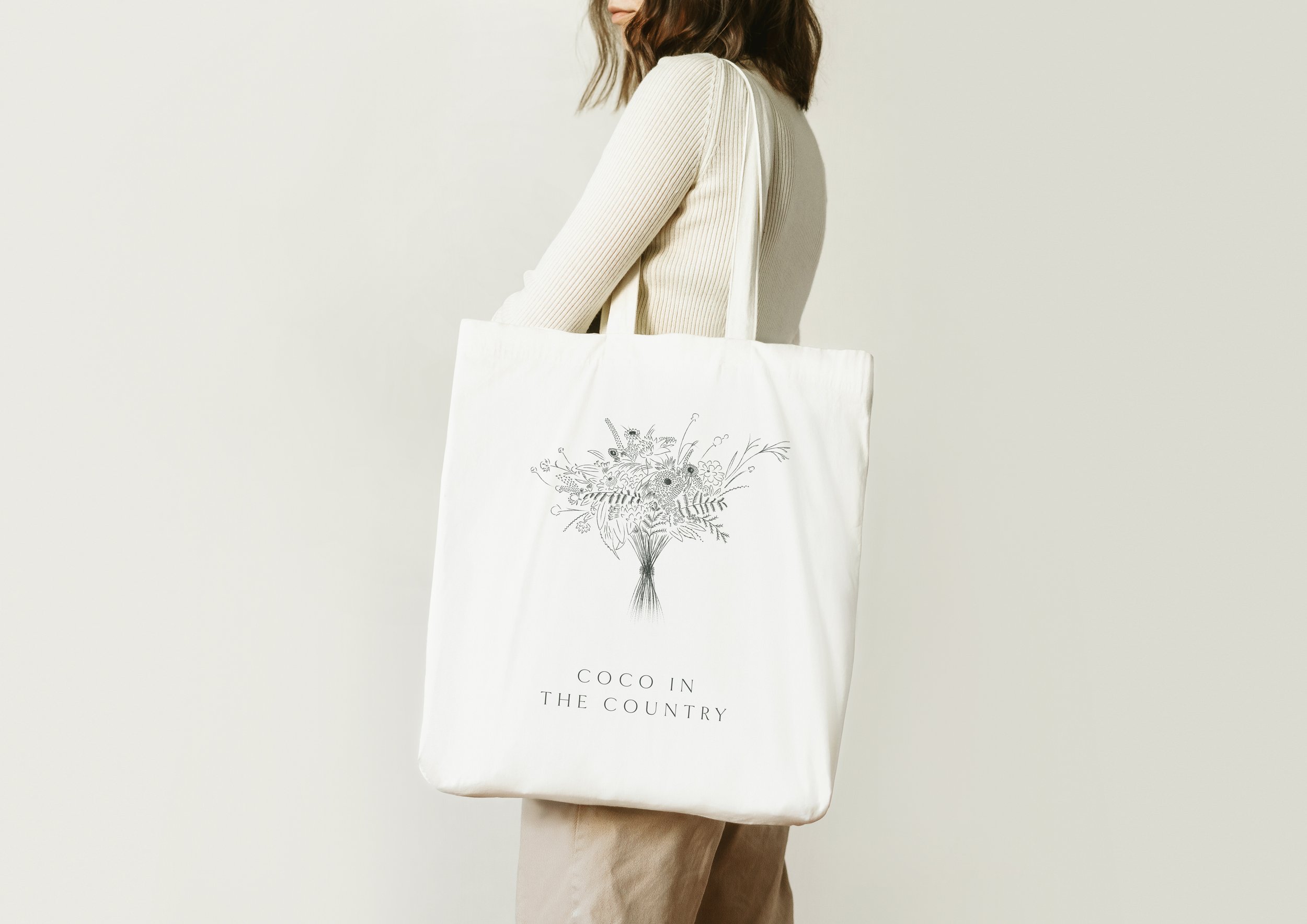
Designed in collaboration with Ellie Maguire (Joyful Creative), the bespoke brand illustrations were based on real Coco in the Country bouquets. Although digital and vector-based in reality (for ultimate versatility), pencil textures and brushes were used to give the illustrations a more natural, grounded and textured feel.
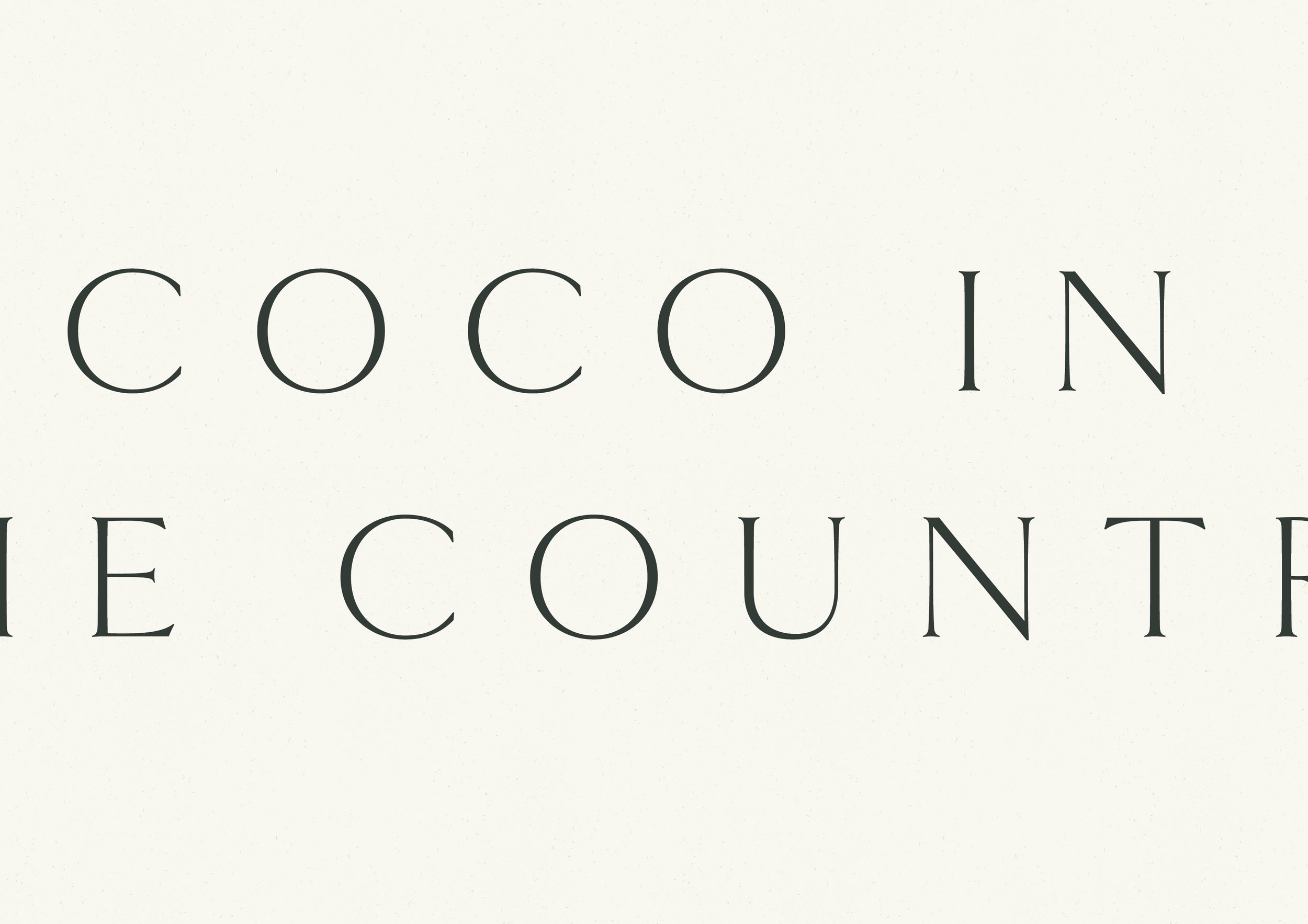
Decorative display typefaces are used in extremely small doses to bring a sense of elevation, gravitas and wildness to the brand, without ever feeling ostentatious or in-your-face.


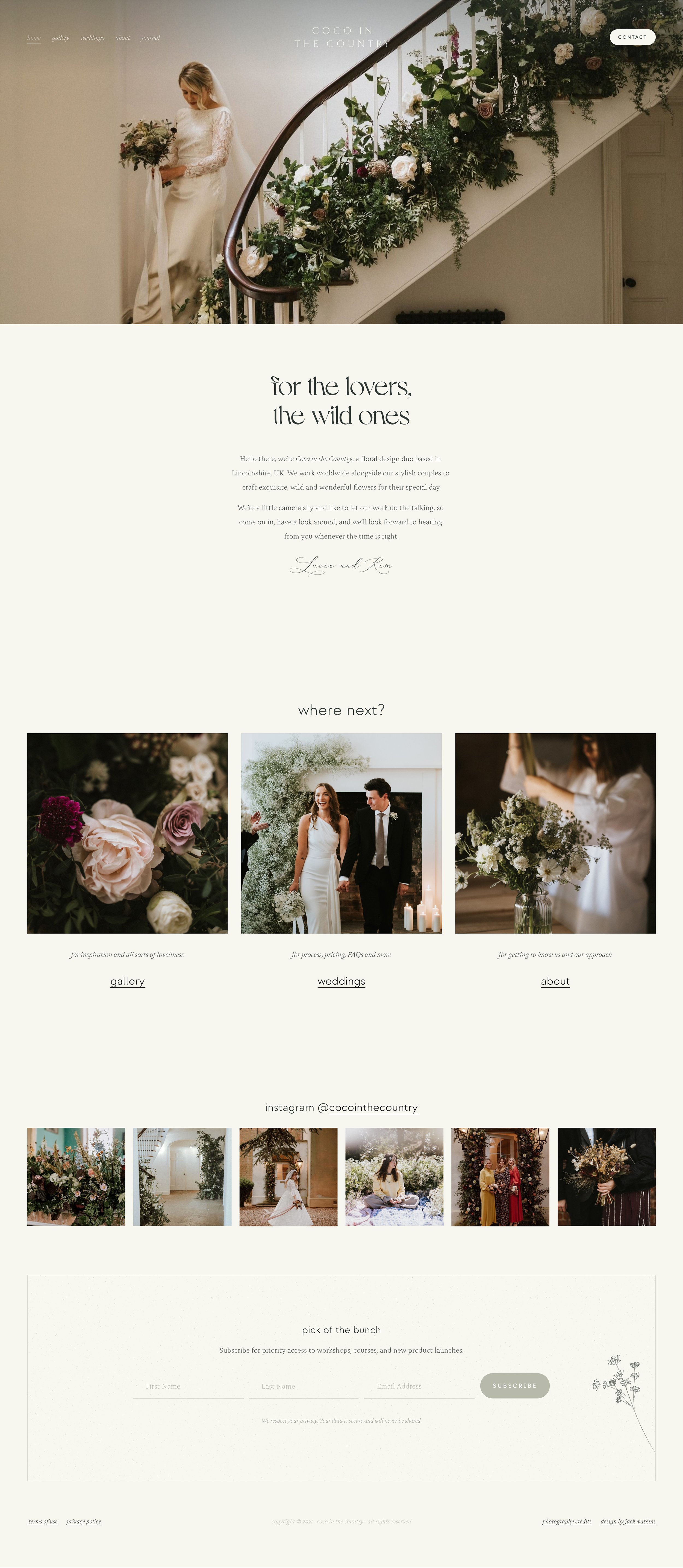
Website design
A place for Coco in the Country’s stylish couples to find both inspiration and information, the website is confident, clear and focused. With impactful imagery and compelling copy, we put a lot of thought into the entire experience, guiding their dreamiest clients through an intentional process that gives them the information they need, when they need it… as well as showcasing a whole host of beautiful flowers and weddings too.

“Jack, you’ve blown us away. Literally every single detail is perfection. Thank you a million times over.”
Lucie & Kim, Floral Designers
