Lucy Nolan
A refined, expressive identity for a virtuoso harpist and collaborator.
- Brand strategy
- Creative direction
- Brand language
- Brand identity
- Art direction
- Website design
Clarity
Lucy Nolan is an award-winning harpist known for her virtuosic command, creative versatility, and bold artistic sensibilities. From concert halls to jazz clubs, electronic soundscapes to classical commissions, she brings clarity, curiosity, and connection to every performance.
Lucy came to me because her old brand and website no longer reflected the kind of projects she wanted to attract. She needed a presence that positioned her not just as a harpist for weddings and private functions, but as a virtuosic artist collaborating on distinctive, ambitious, and dynamic work.
Brand essence
Virtuosic · Expressive · Dependable
These qualities capture Lucy’s studied precision and credibility, her creativity and artistic boldness, and her approachable, collaborative nature — giving her brand both stature and warmth.
“Jack is a true artist when it comes to brands and designing. He is thoughtful and conscientious every step of the way and really tries to understand you as an individual and what your business needs. His attention to detail is meticulous and he went above and beyond in helping me with all manner of queries. 100% recommend him!”
Lucy Nolan · Harpist
Creative direction
The creative direction strikes a balance between elevation and openness. Dramatic serifs paired with modern sans-serif type create confidence and movement, while layouts use negative space and subtle asymmetry to echo the harp itself — smooth and sharp, refined yet dynamic.


Colour palette
Bold, intense and clear.
A bold palette of inky blacks, warm whites, and opulent golds conveys sophistication, clarity, and success. The inky tones carry hints of blue, bringing a sense of intelligence and trustworthiness, while the gold provides warmth and brilliance against the openness of white.
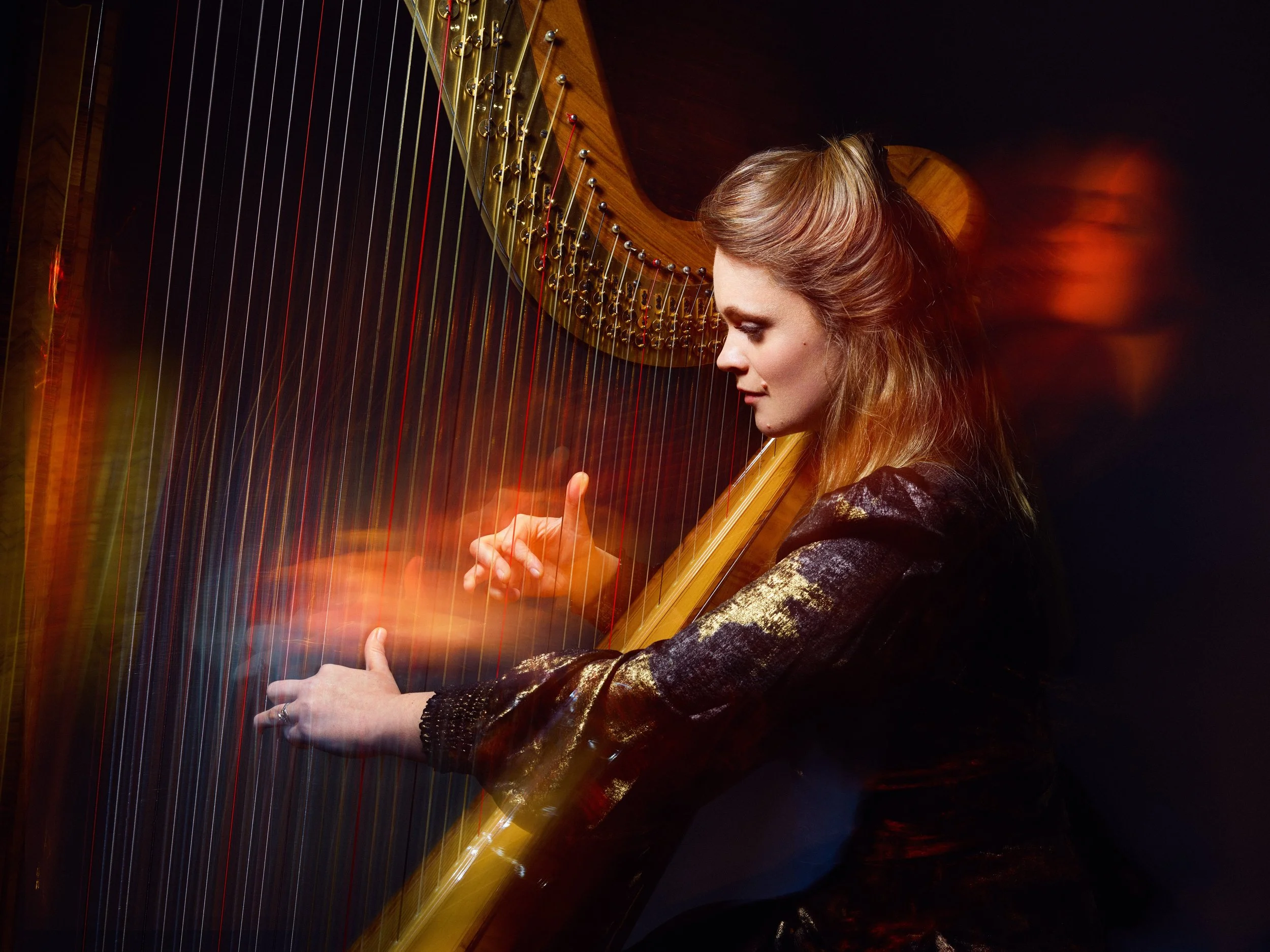
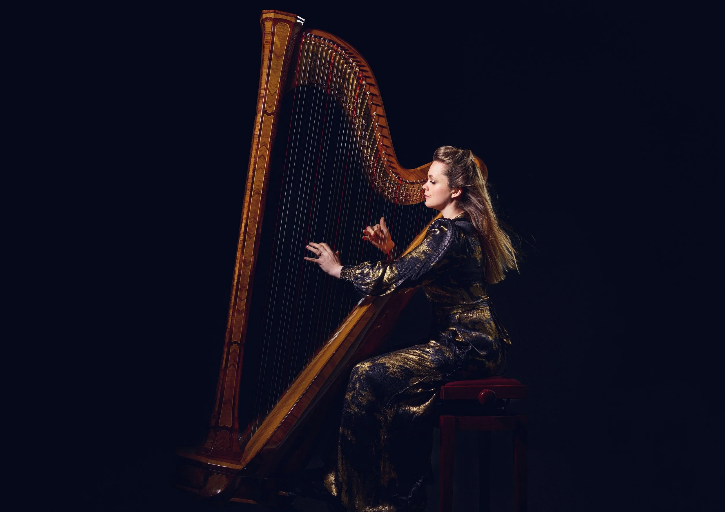
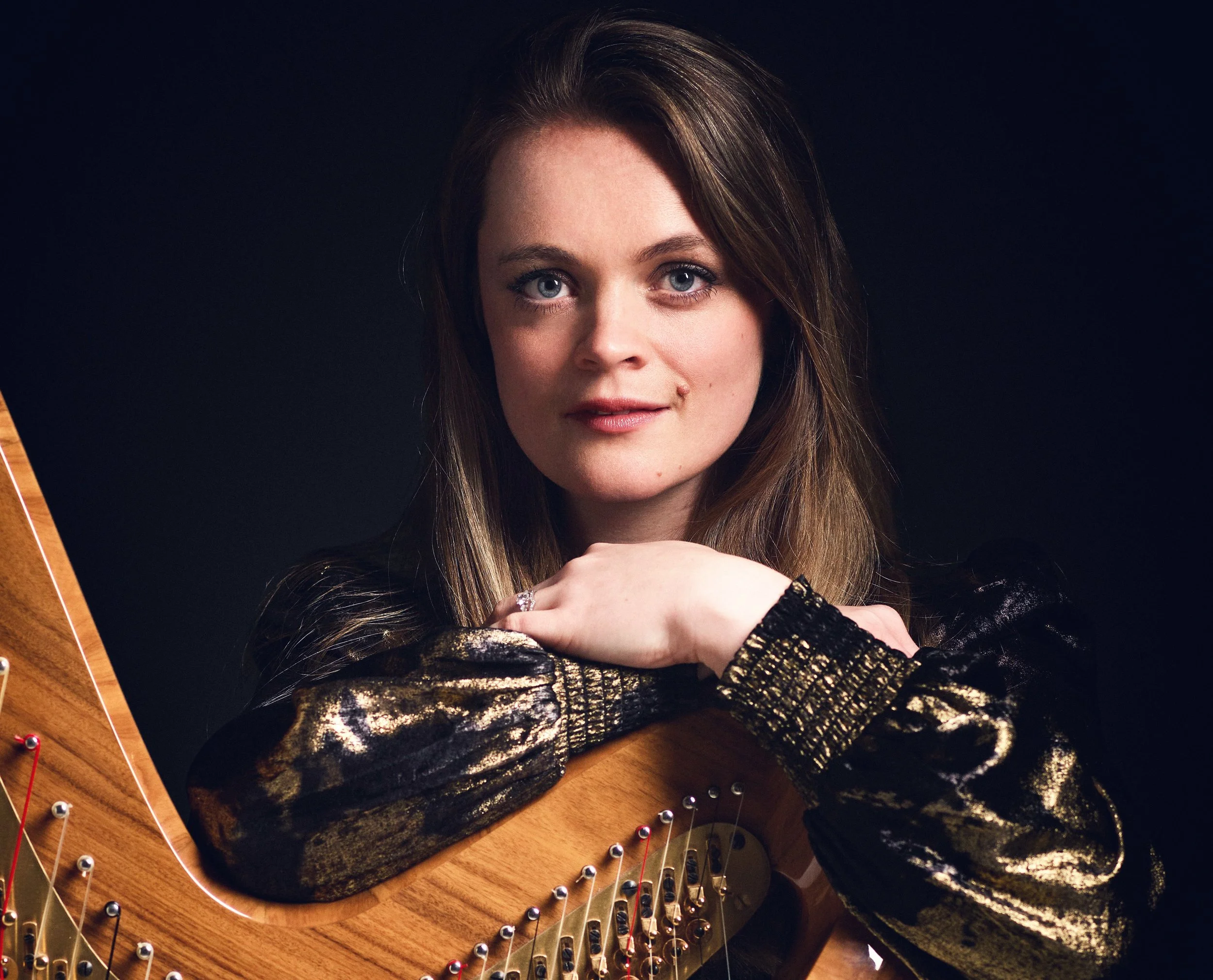
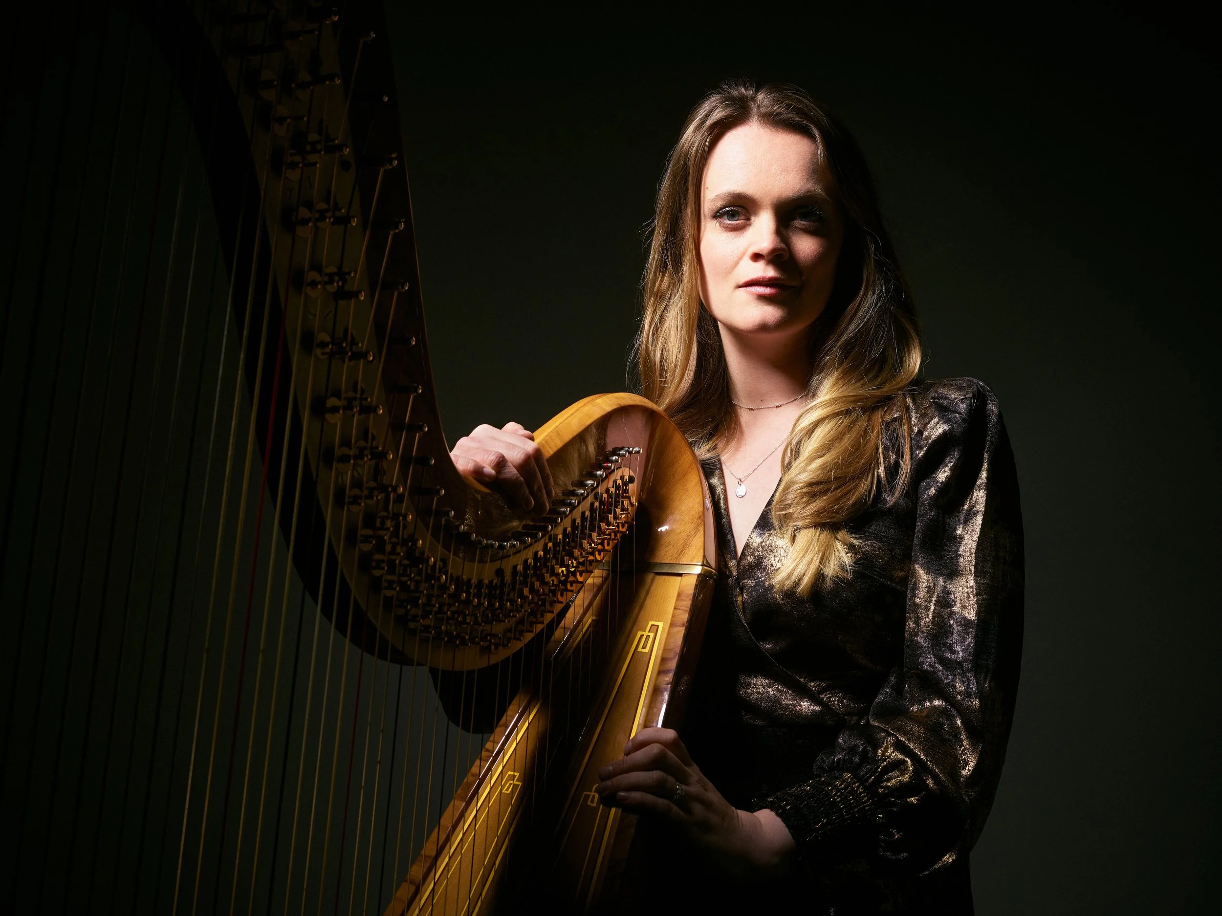
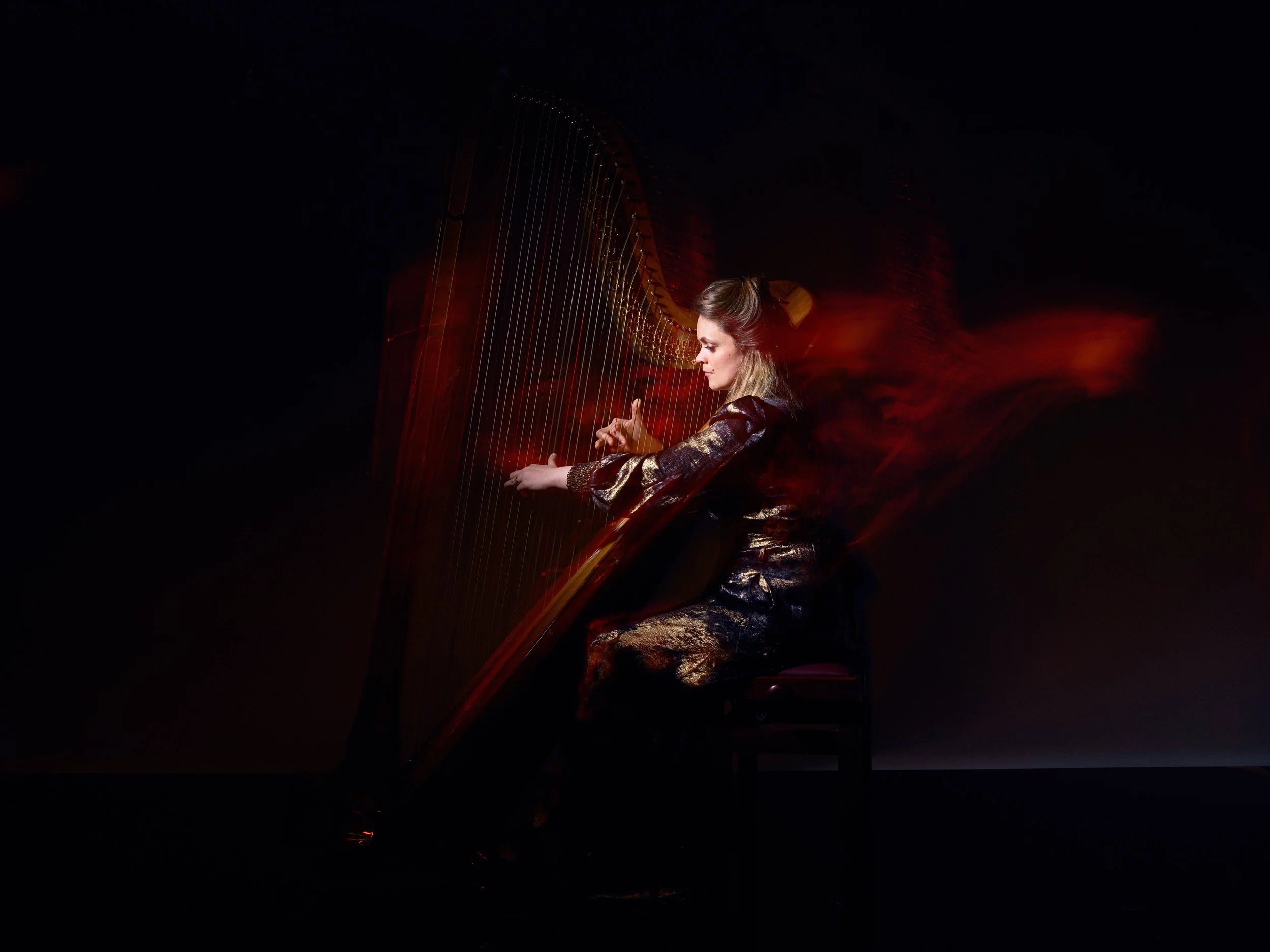
Photography
I art-directed Lucy’s brand shoot to align with her new identity — bold, dramatic, and flowing. We carefully considered poses, backgrounds, and outfits to create imagery that felt both elevated and expressive. High-contrast lighting and dynamic movement captured the duality of refinement and creativity, giving us a library of visuals that feel exclusive yet versatile across the website and wider brand.


Typography
Typography is a defining element of Lucy’s brand identity. Dramatic serif headings convey confidence and refinement, paired with clean sans-serif body copy for clarity and approachability. A single character in each heading shifts into a script-like form — a subtle flourish that adds movement, drama, and individuality, echoing both the fluidity and precision of the harp.


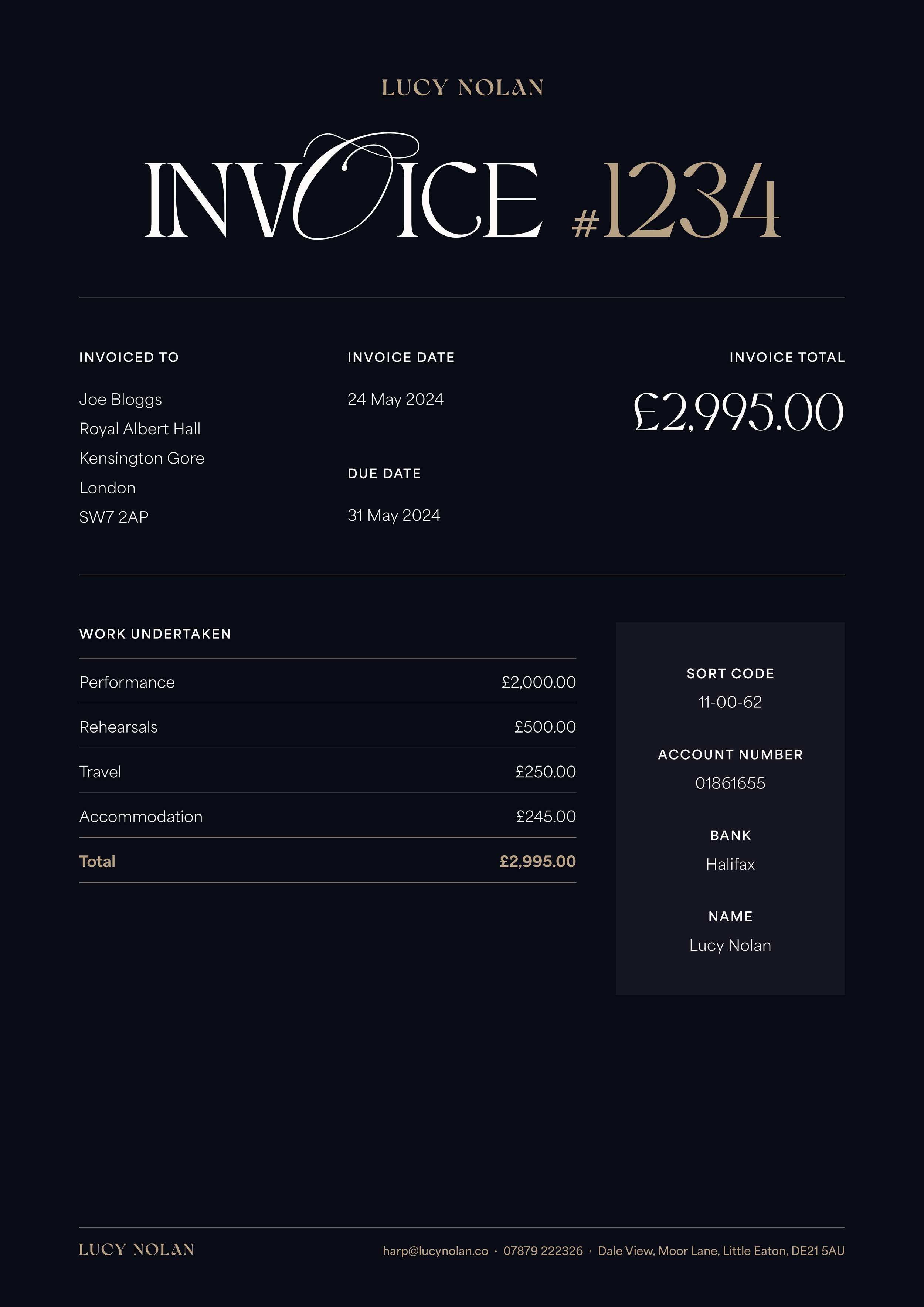
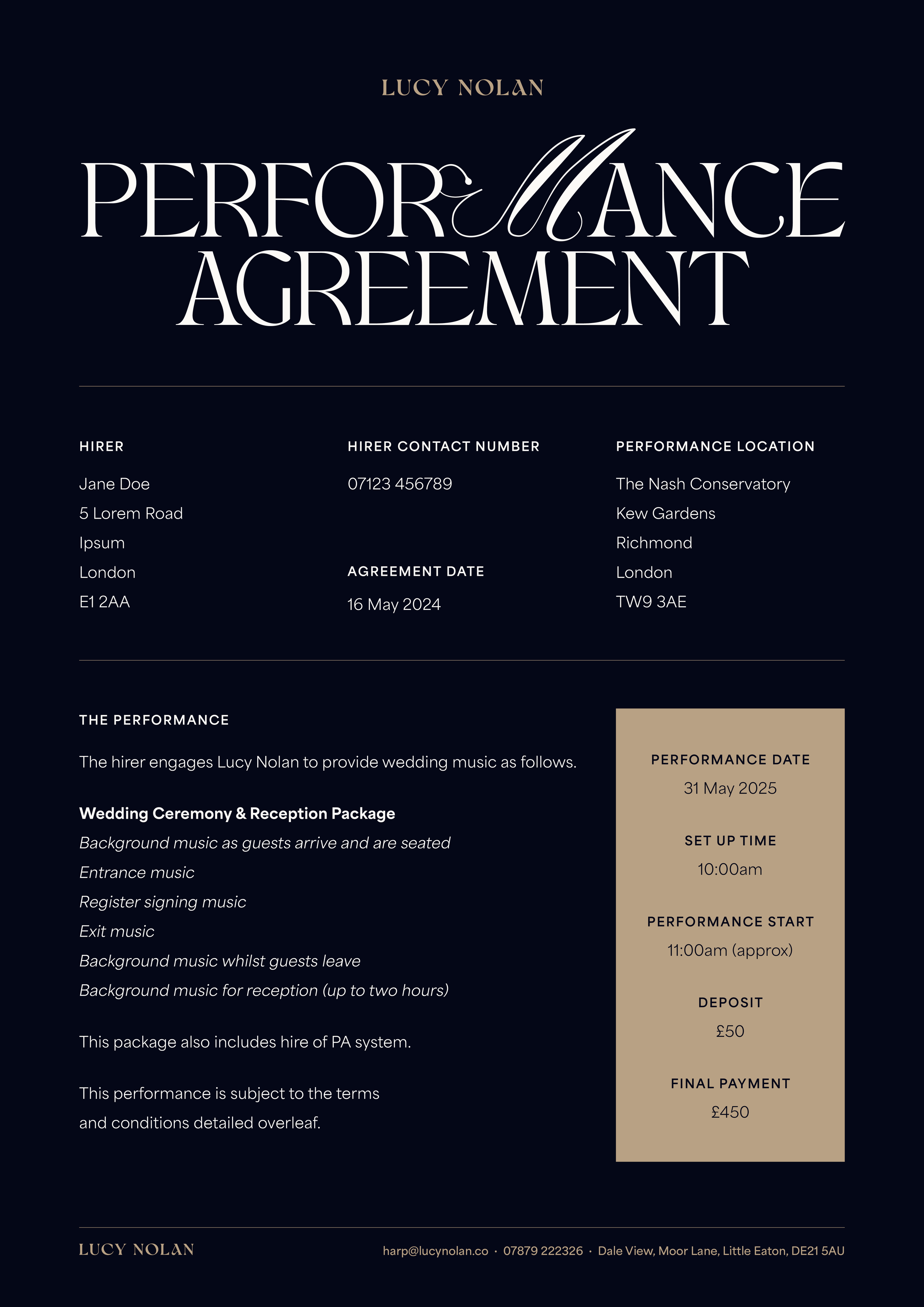
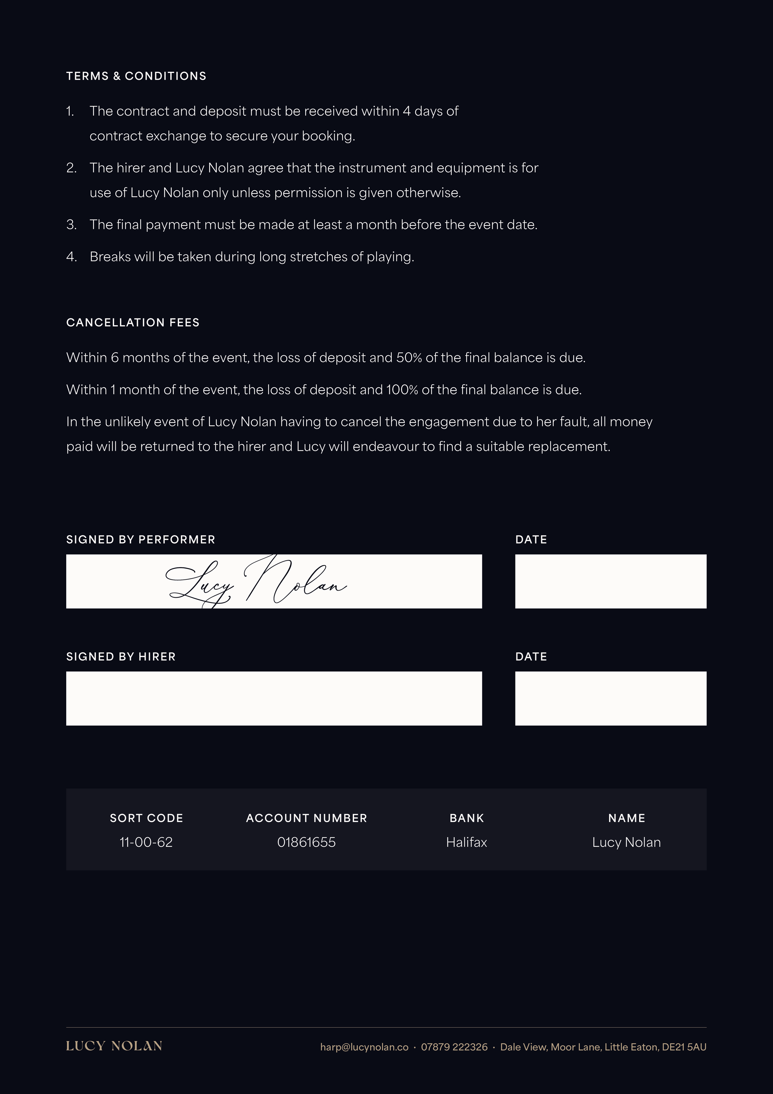
In PracticE

Language
The brand voice is succinct, confident, and welcoming — designed to reflect Lucy’s professionalism while keeping her approachable. Small but deliberate choices in wording helped shift her positioning into a more elevated space: “Diary”became “Calendar,” “Events” became “Appearances,” and “Weddings” became “Private Events.” Every word was chosen to carry clarity, warmth, and refinement.
Website design
Lucy’s new website is designed to showcase her multifaceted work with clarity and confidence. Sections highlight solo performance, ensembles, orchestral work, collaborations, teaching, and resources, all unified under a refined identity.

Collaborators
Photography
Nathan Damour